
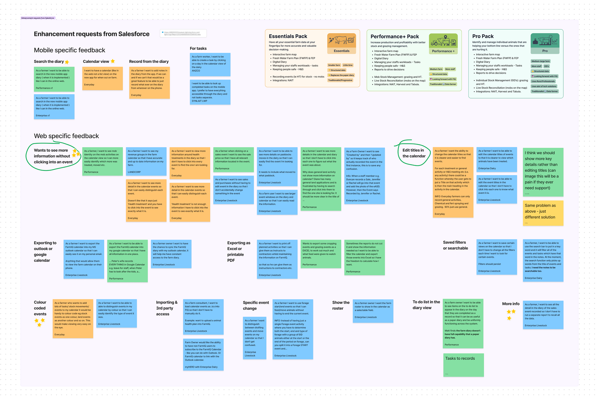
Enhancement requests from customers who ring support
Enhancement requests in the Web application
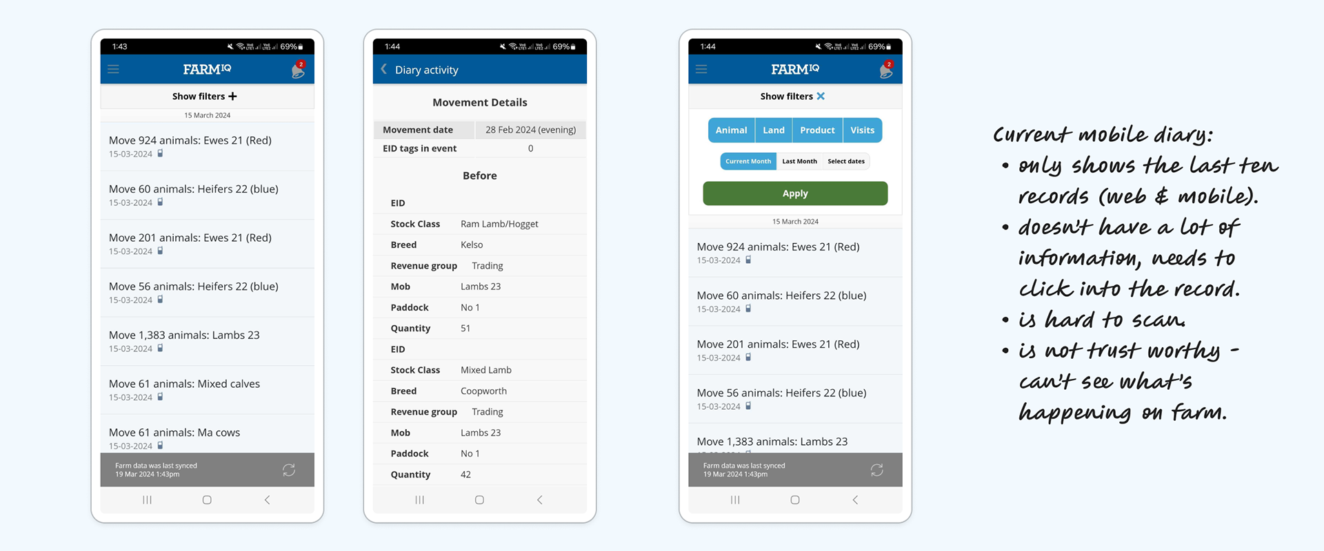
The Classic app frustrating diary experience
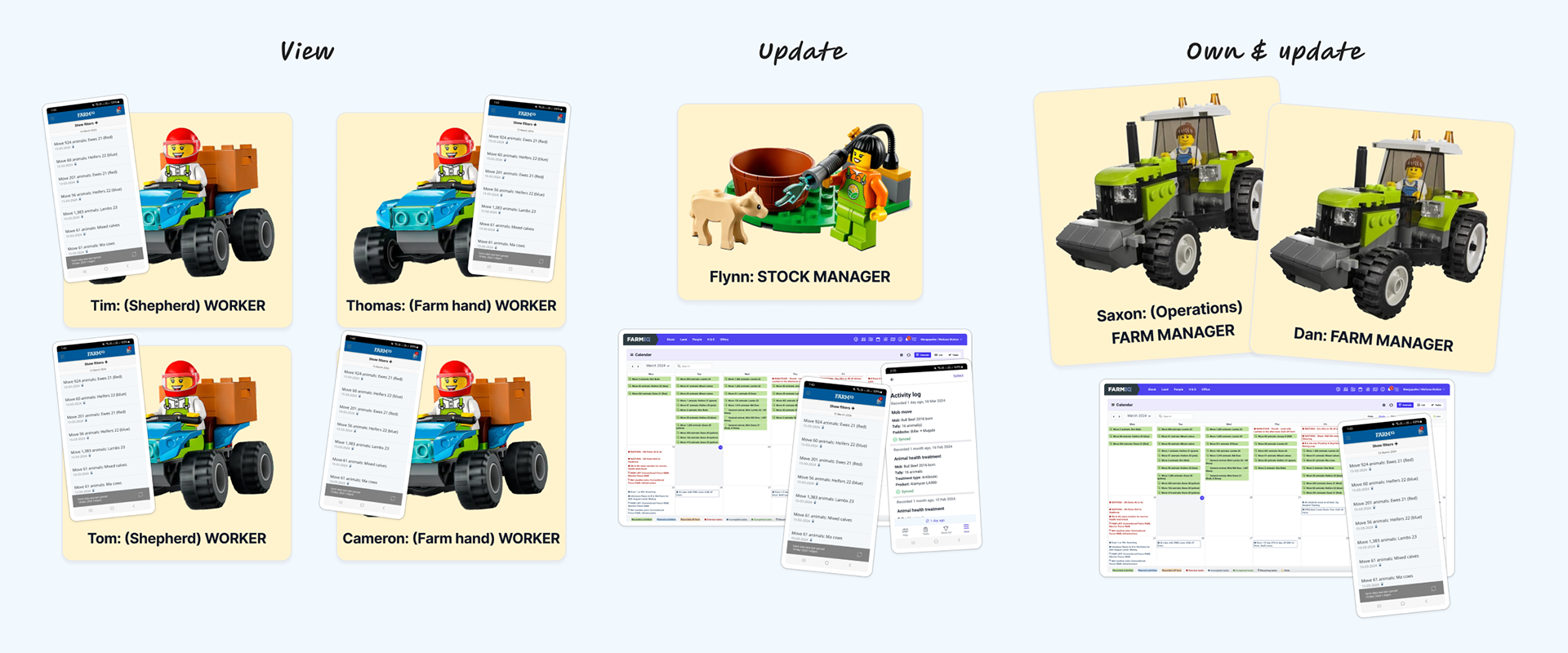
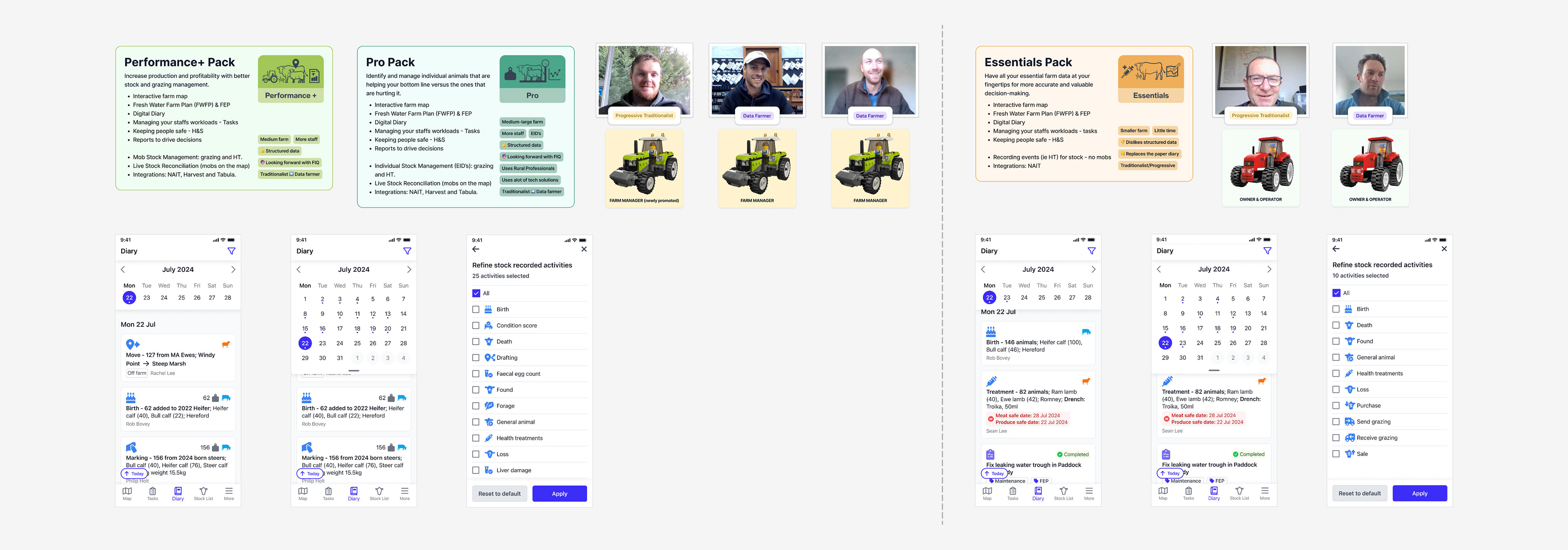
The complexity of how different roles use the Classic app mobile diary
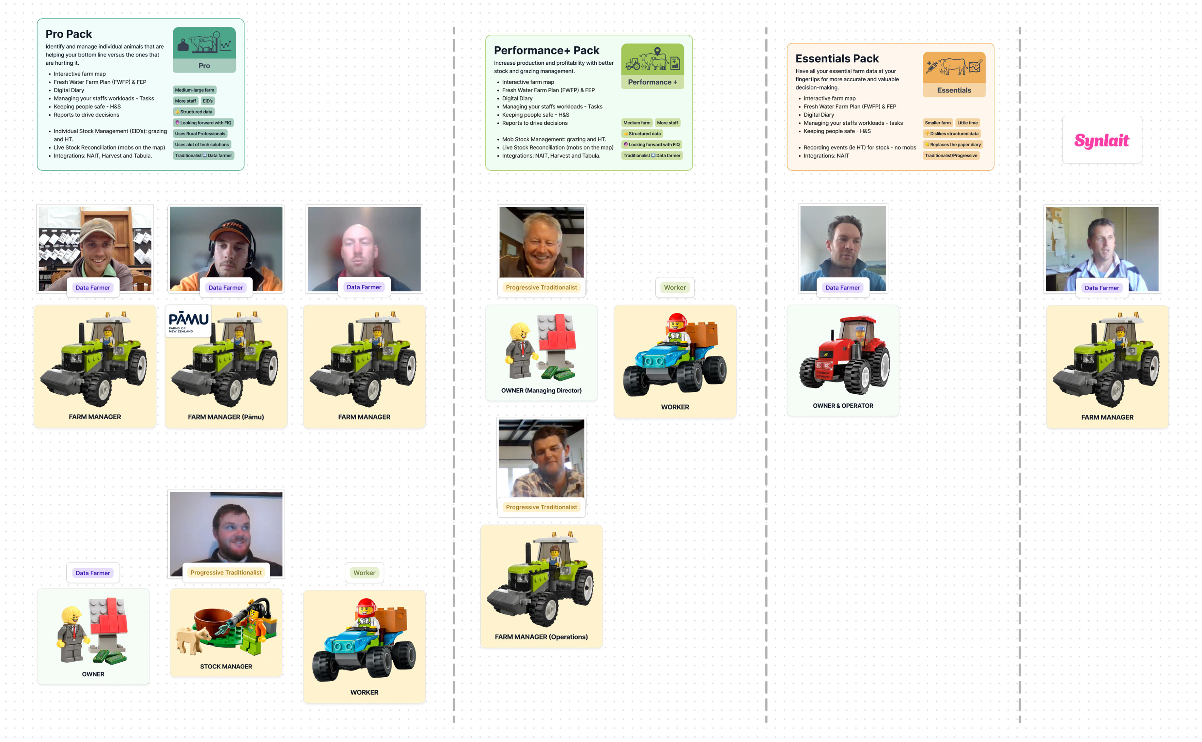
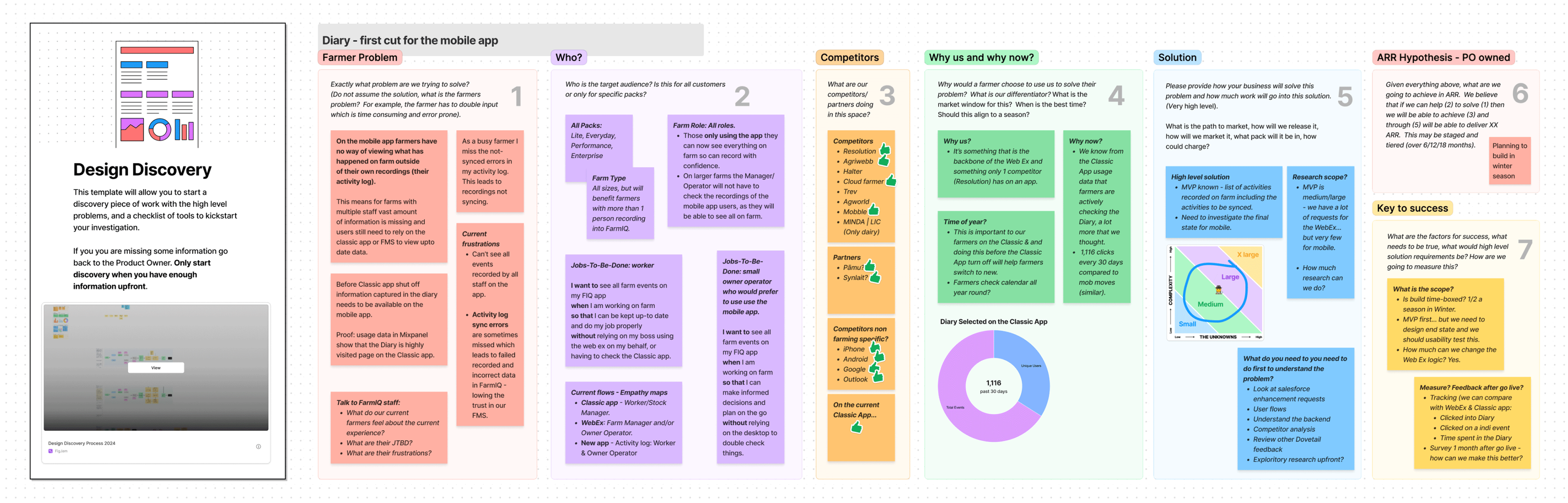
The farmers we interviewed for our initial exploratory research
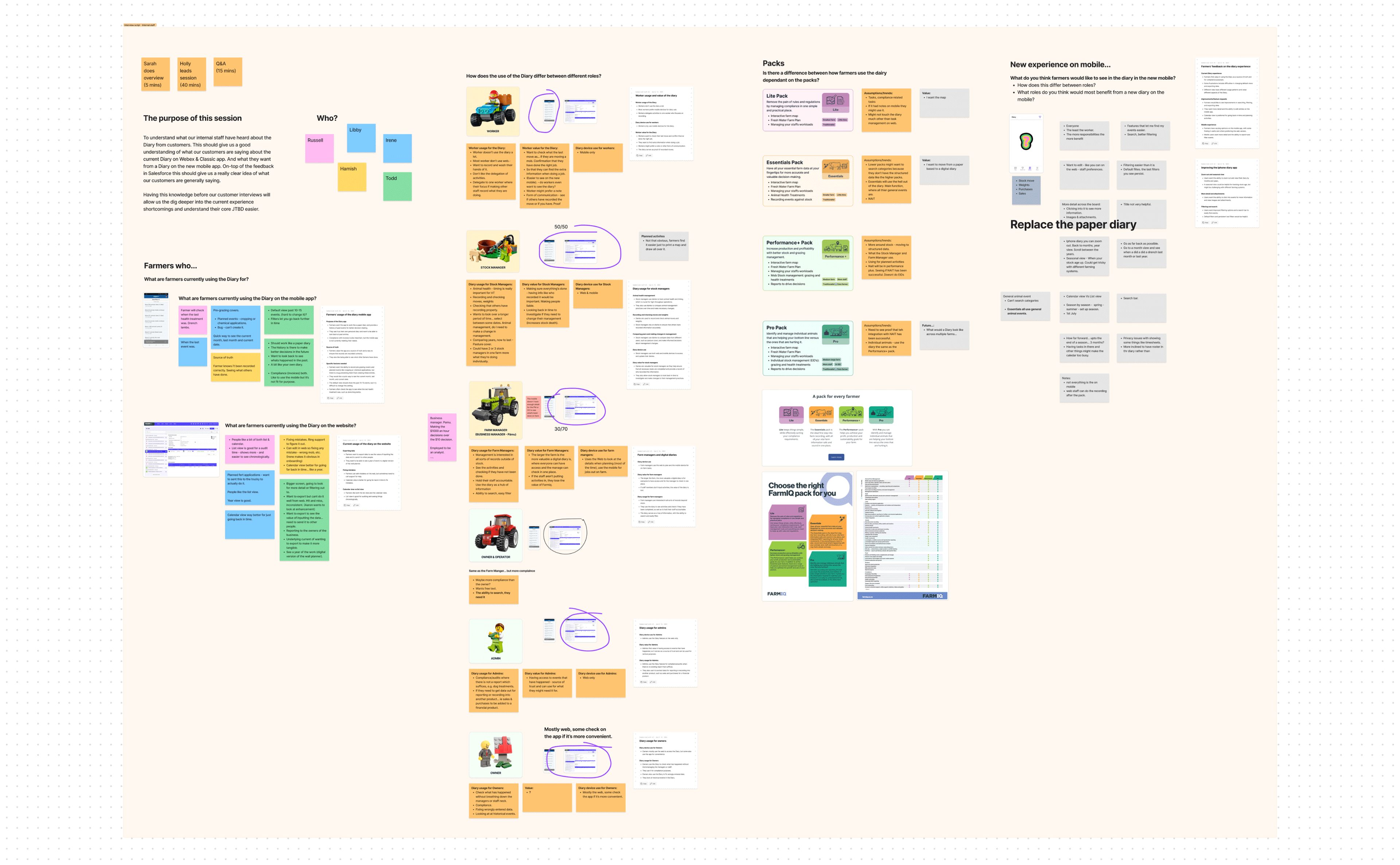
Our initial internal stakeholder workshop
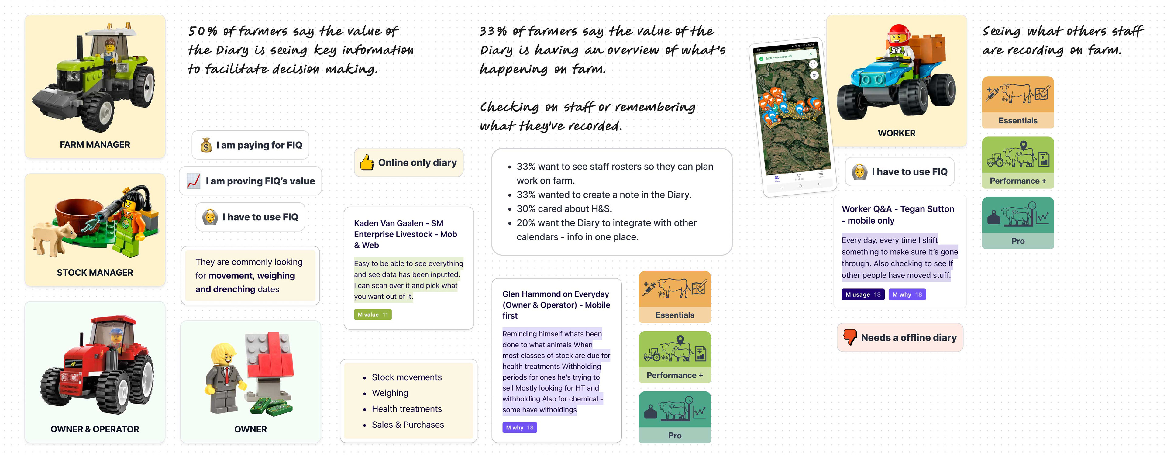
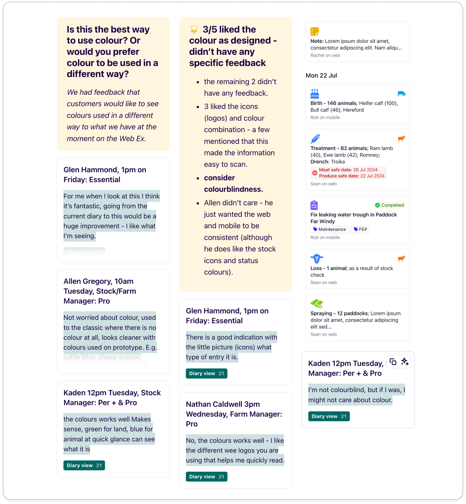
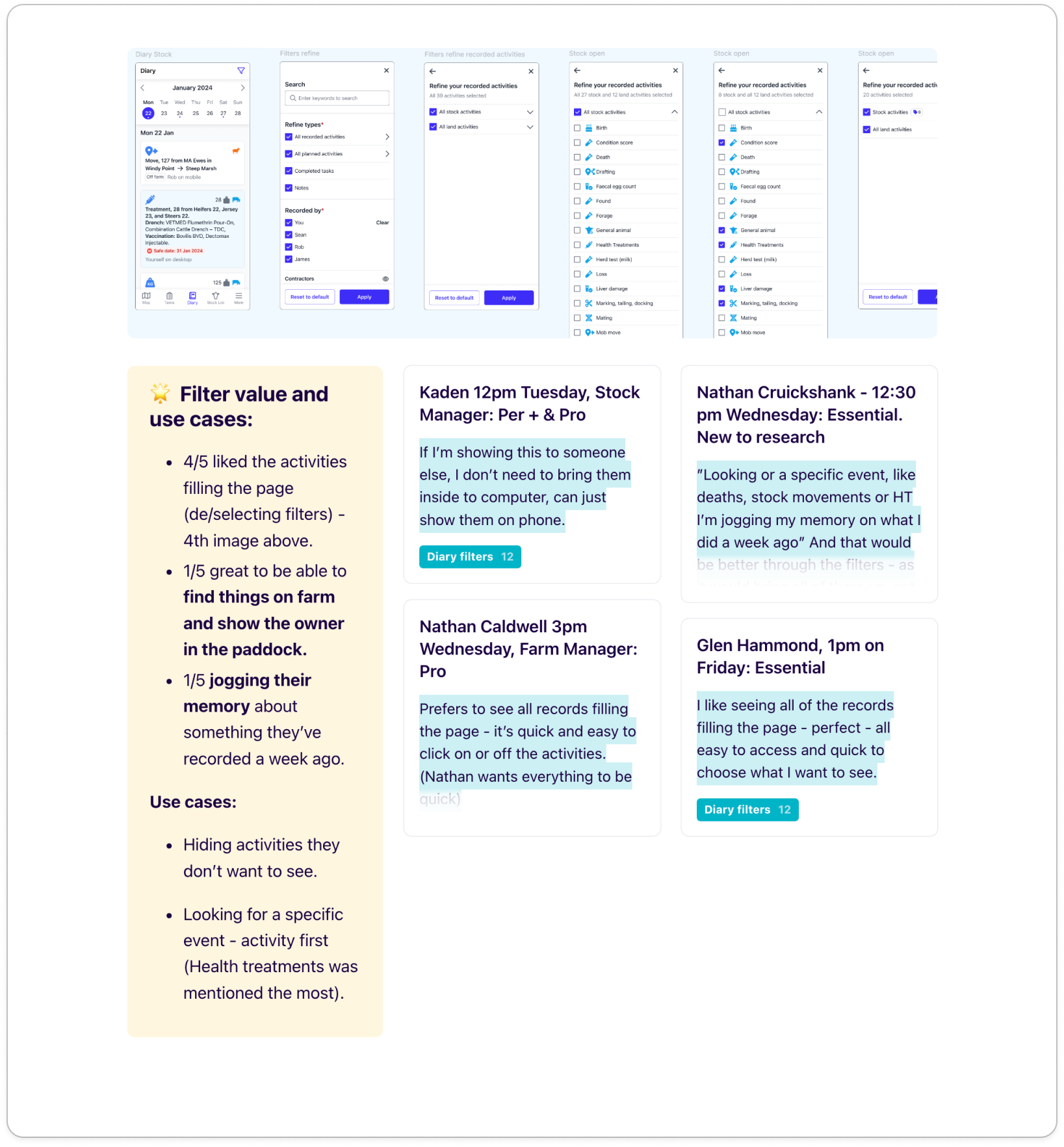
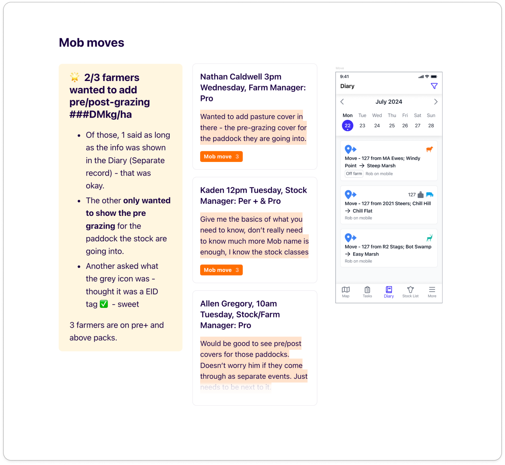
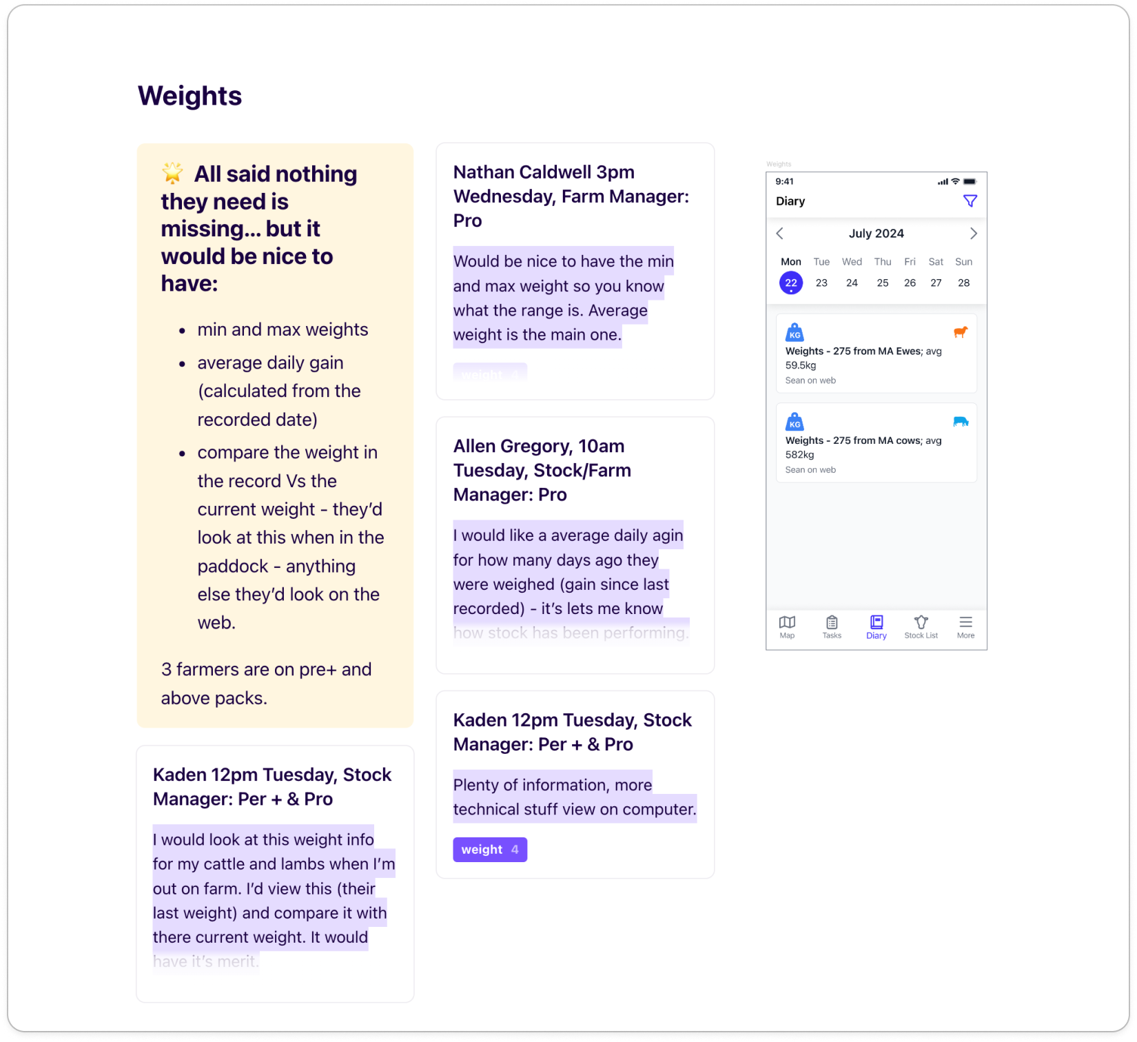
The value and purpose of an online only diary - key takeaways from our research
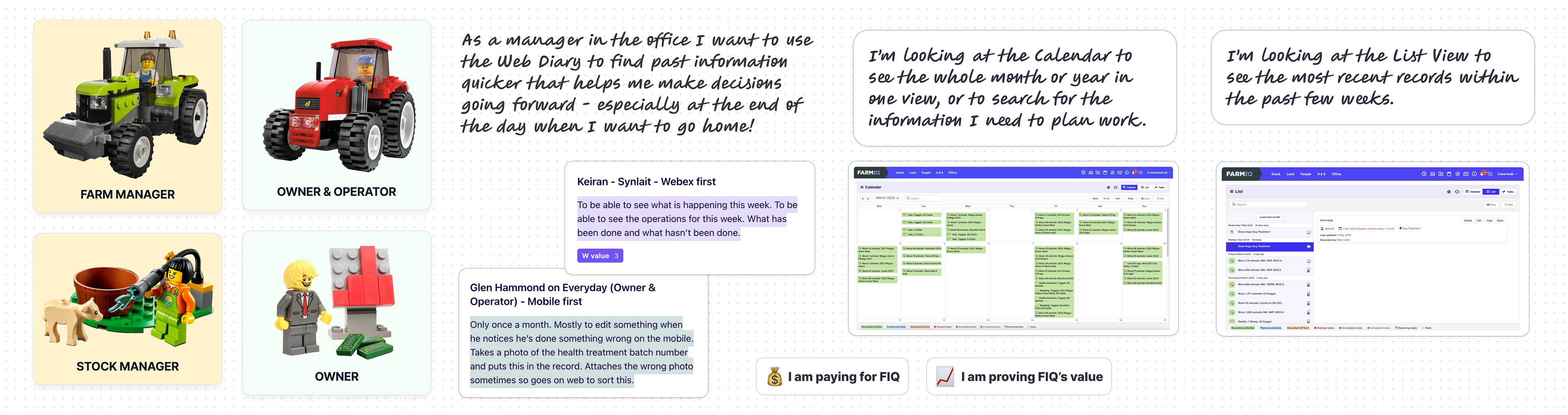
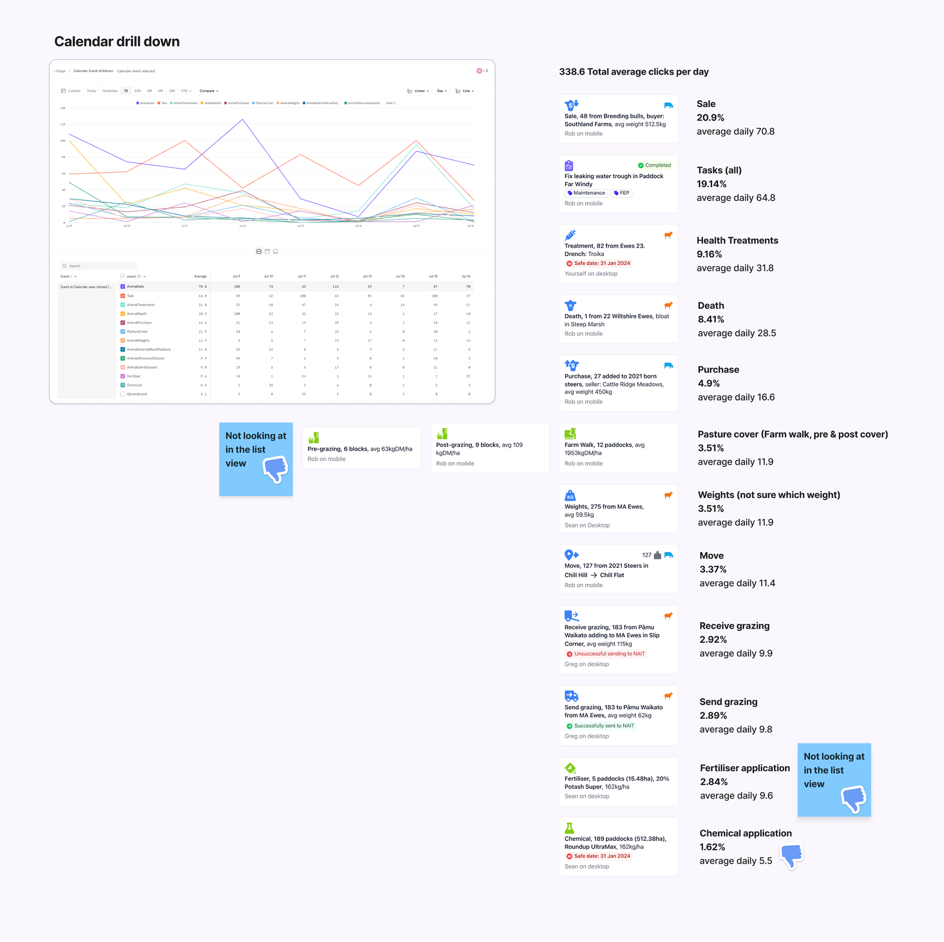
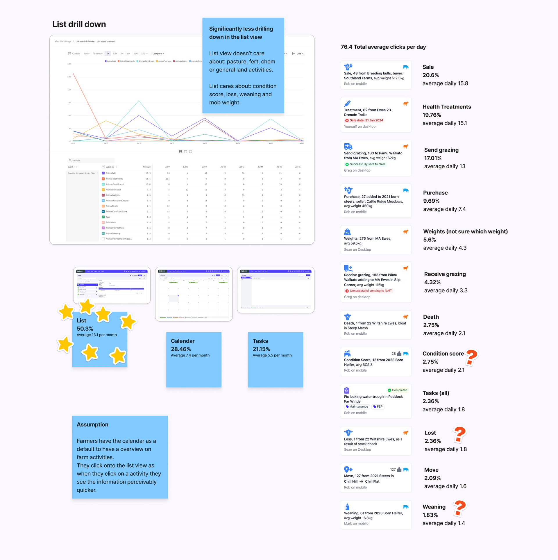
The value and purpose of the calendar and list view on the web diary - key takeaways from our research
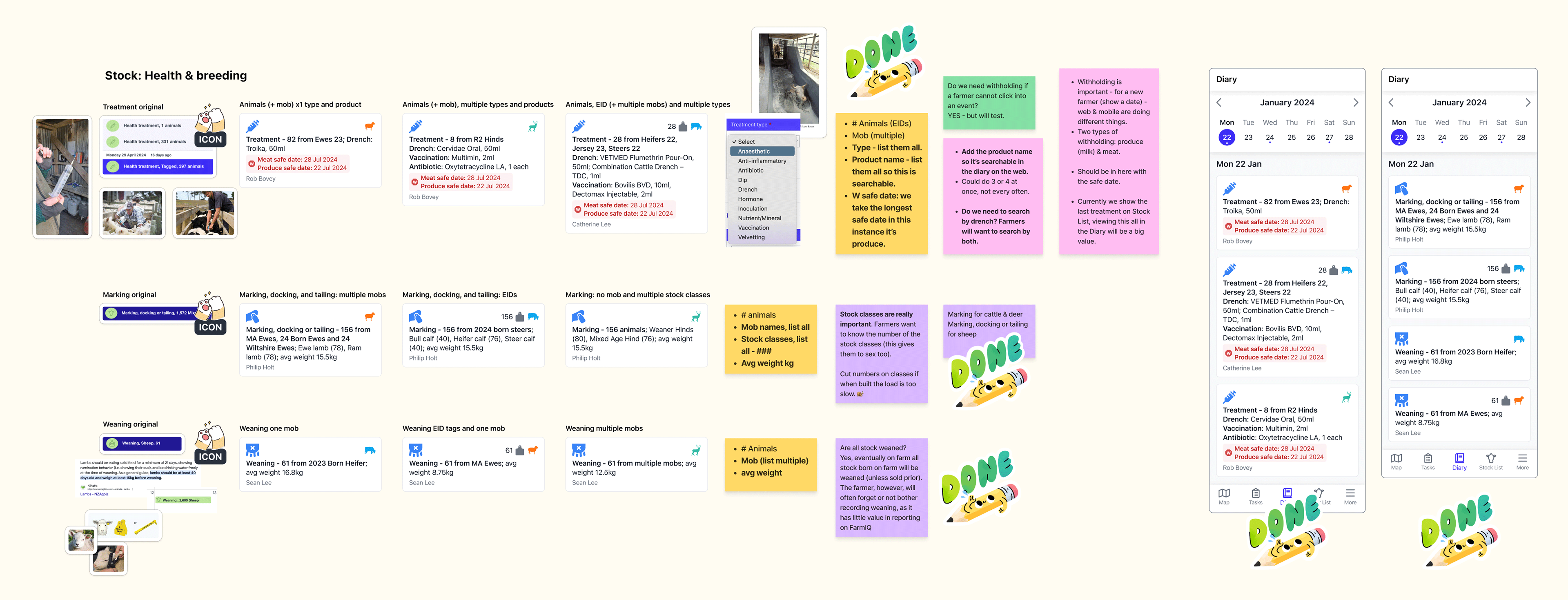
The workings of updating the information on 3 record summaries out of the total 36
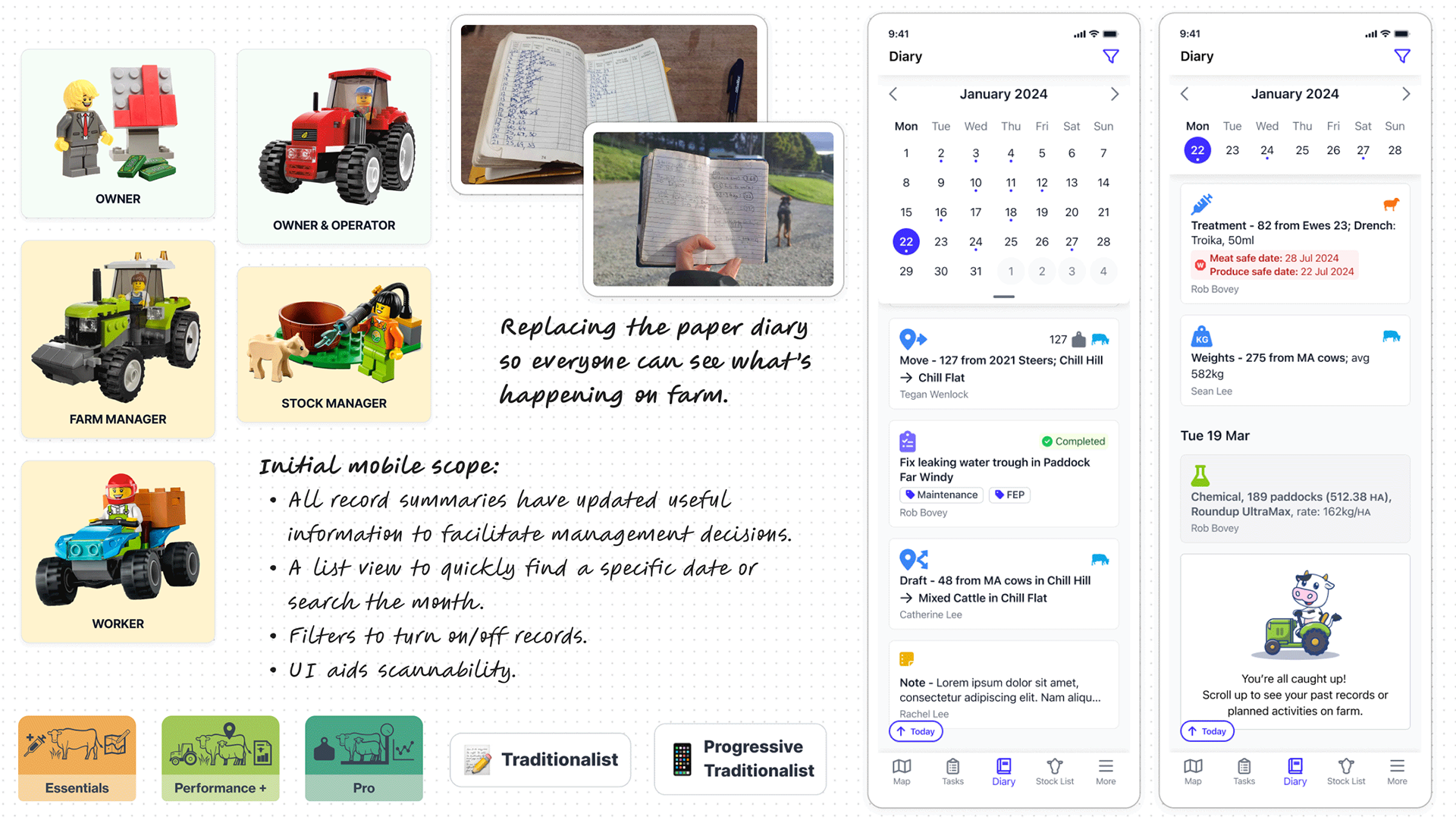
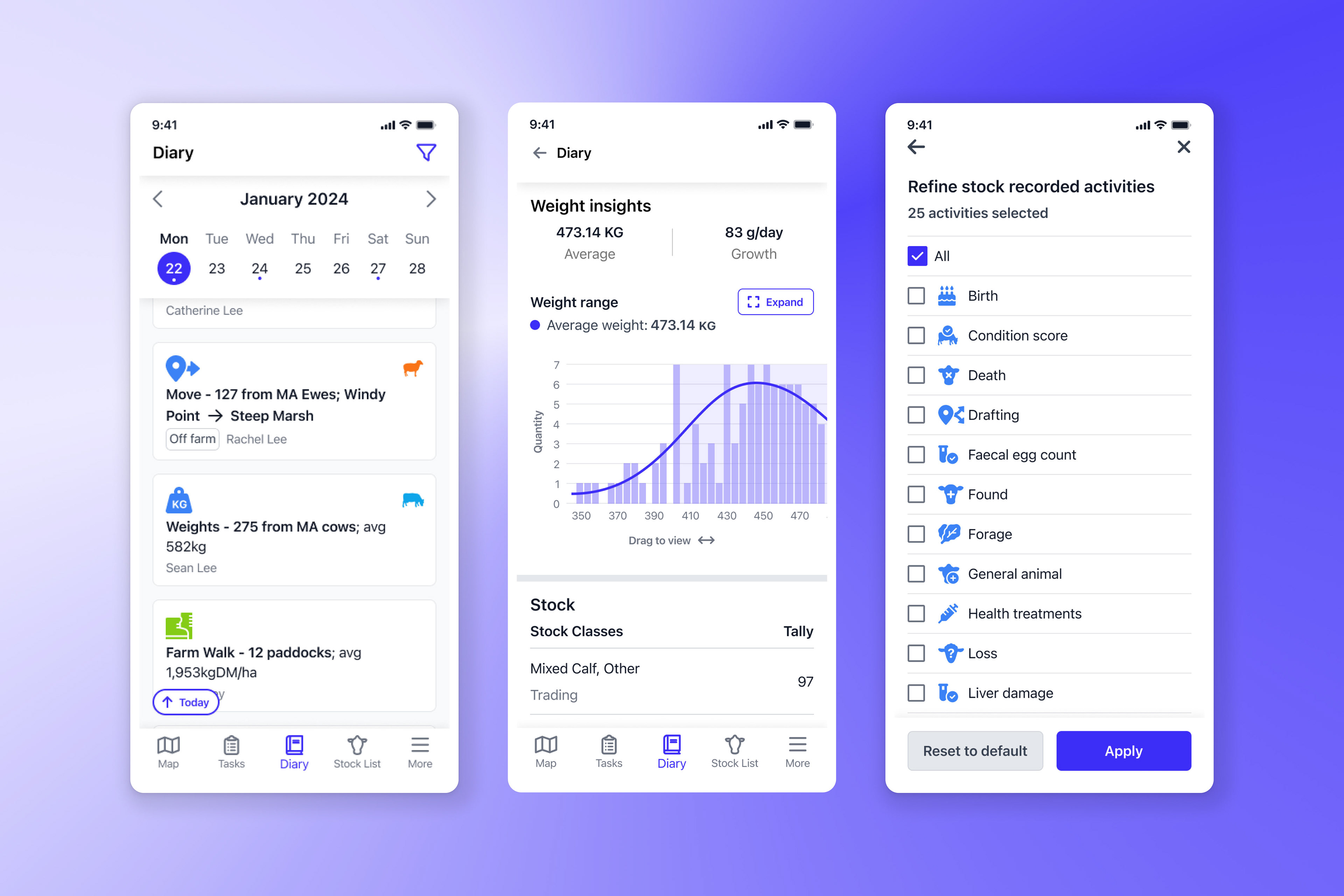
First cut of the Diary on the mobile app
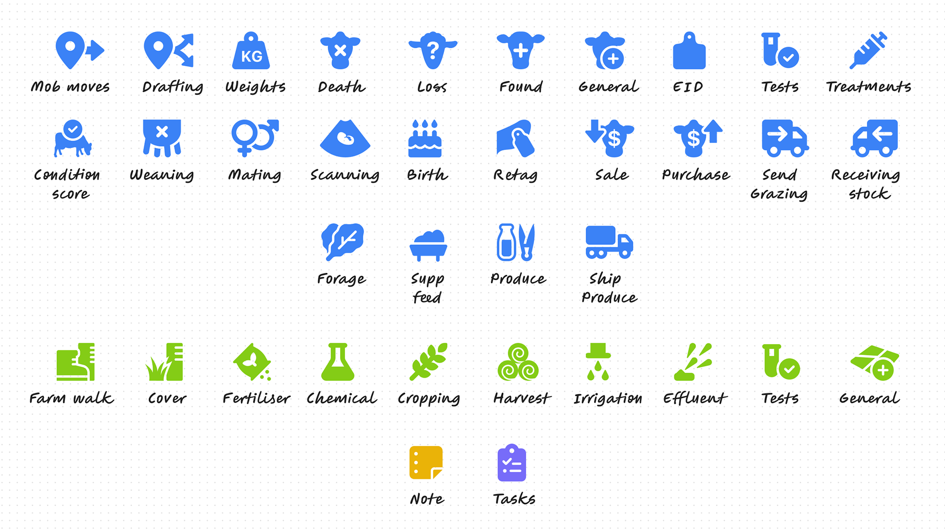
All 36 new icons for all records: stock, land, notes and tasks
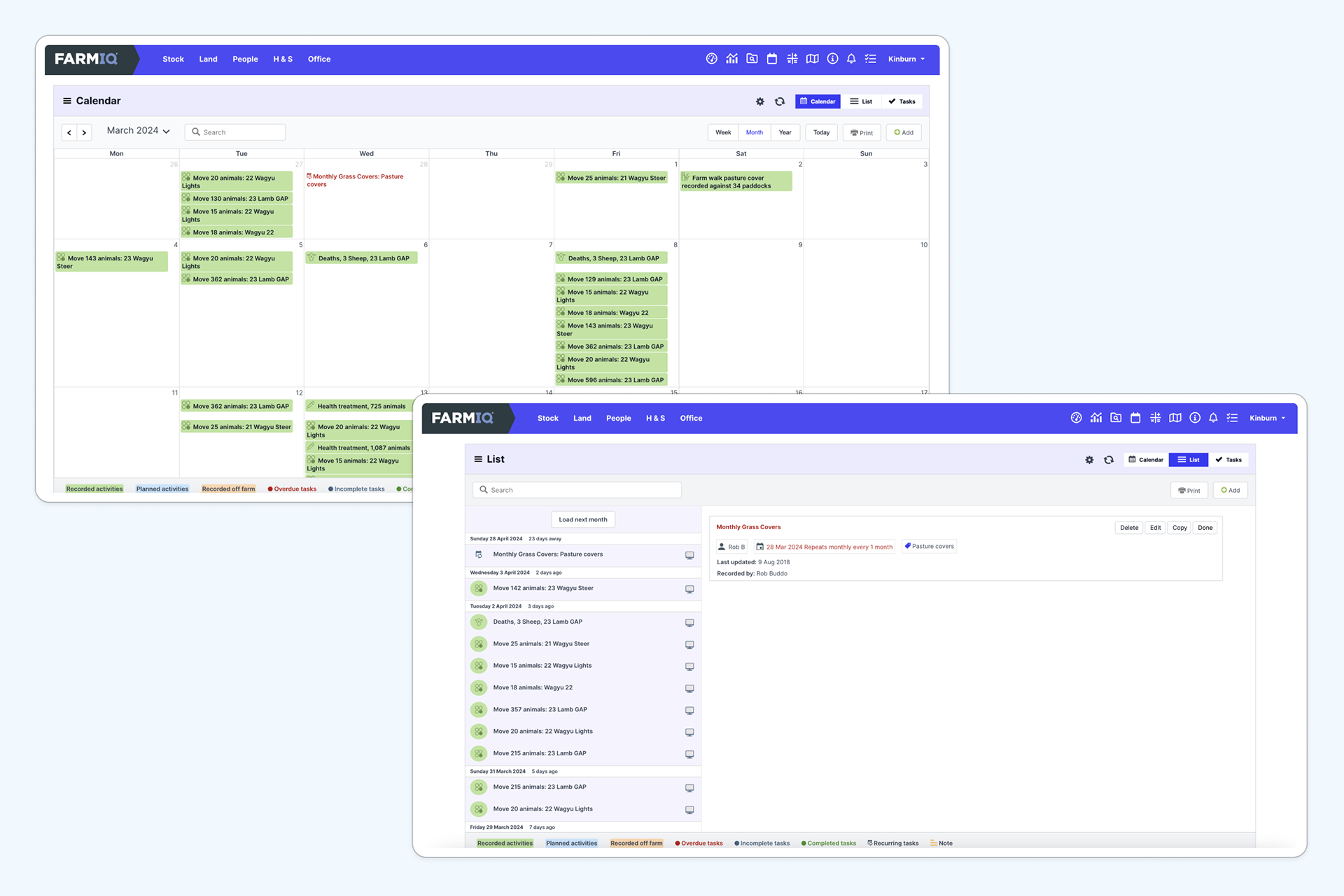
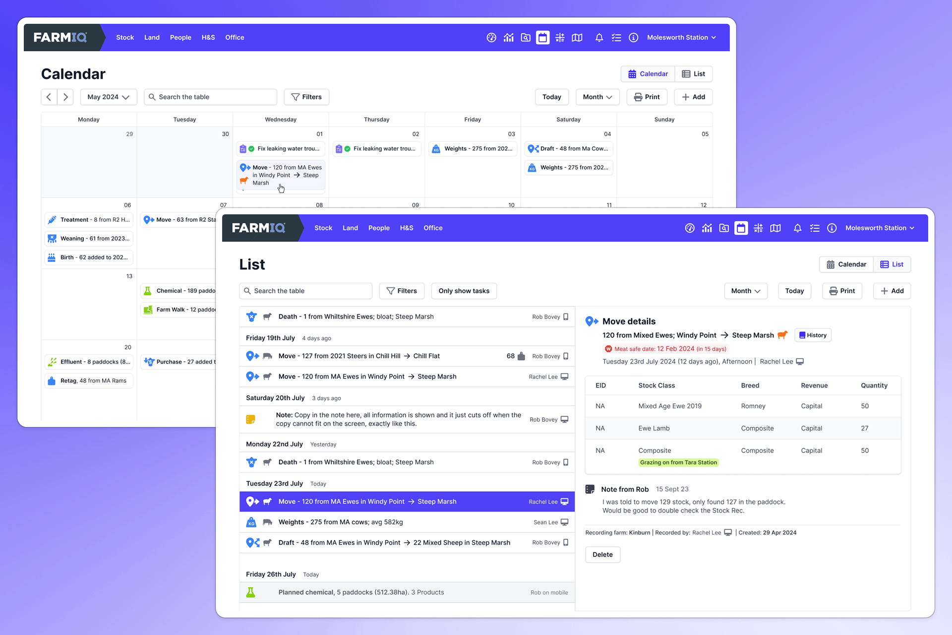
Original Calendar and List view

Enhanced Calendar and List View - seeing more information upfront
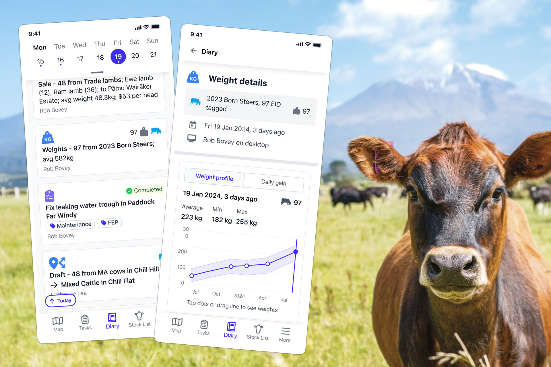
Quick access to weights helps farmers manage stock health, productivity, and profitability more effectively.
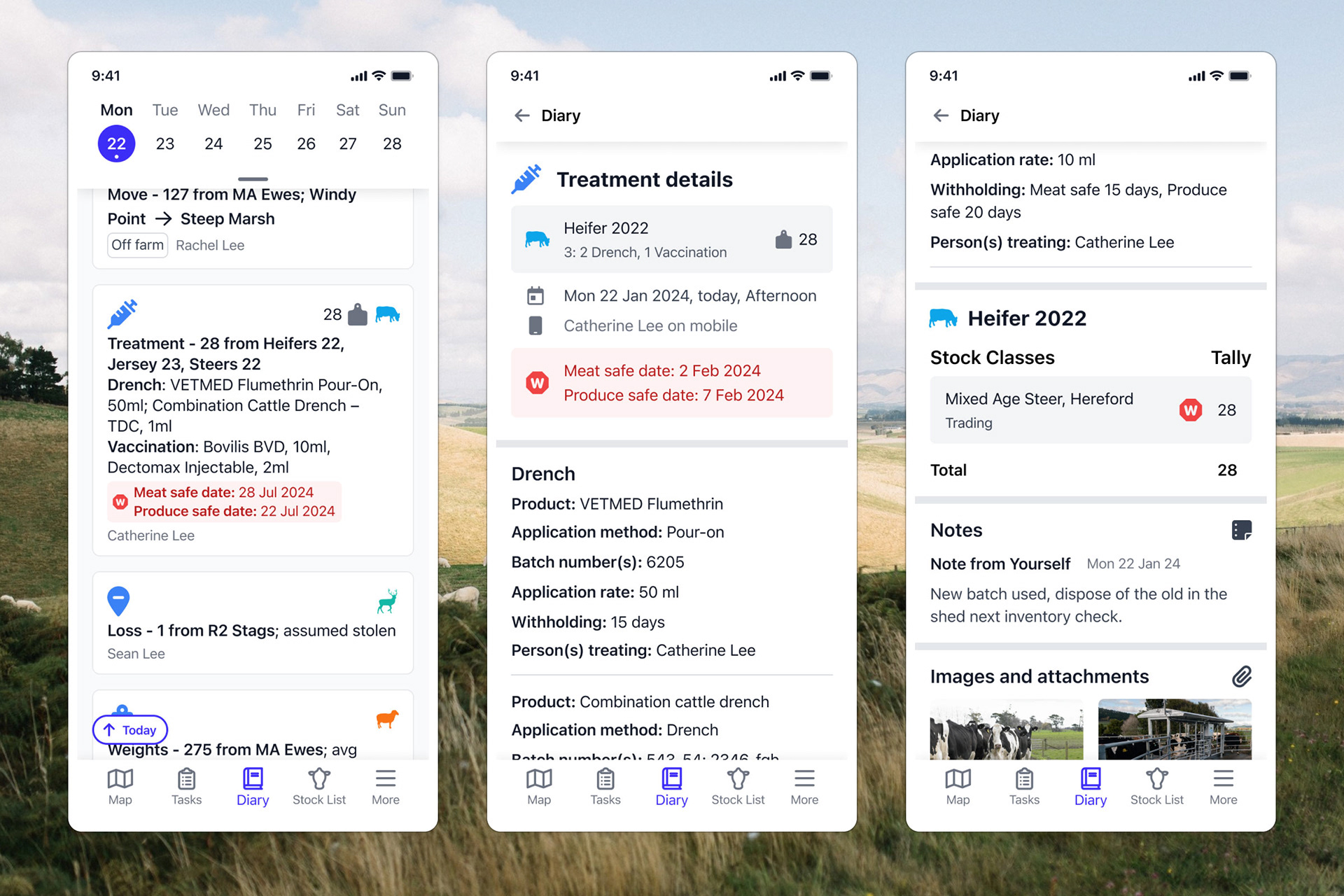
Quick access to health treatment information helps farmers protect their stock, business, and the public.
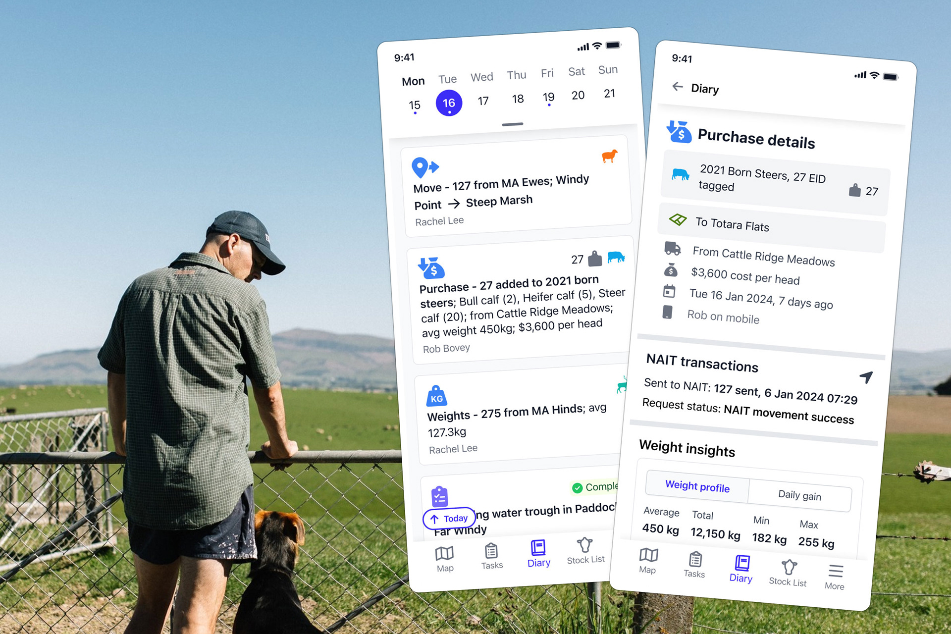
Quick access to sale and purchase information helps farmers make timely, informed decisions that impact profitability and ensure smooth farm operations.
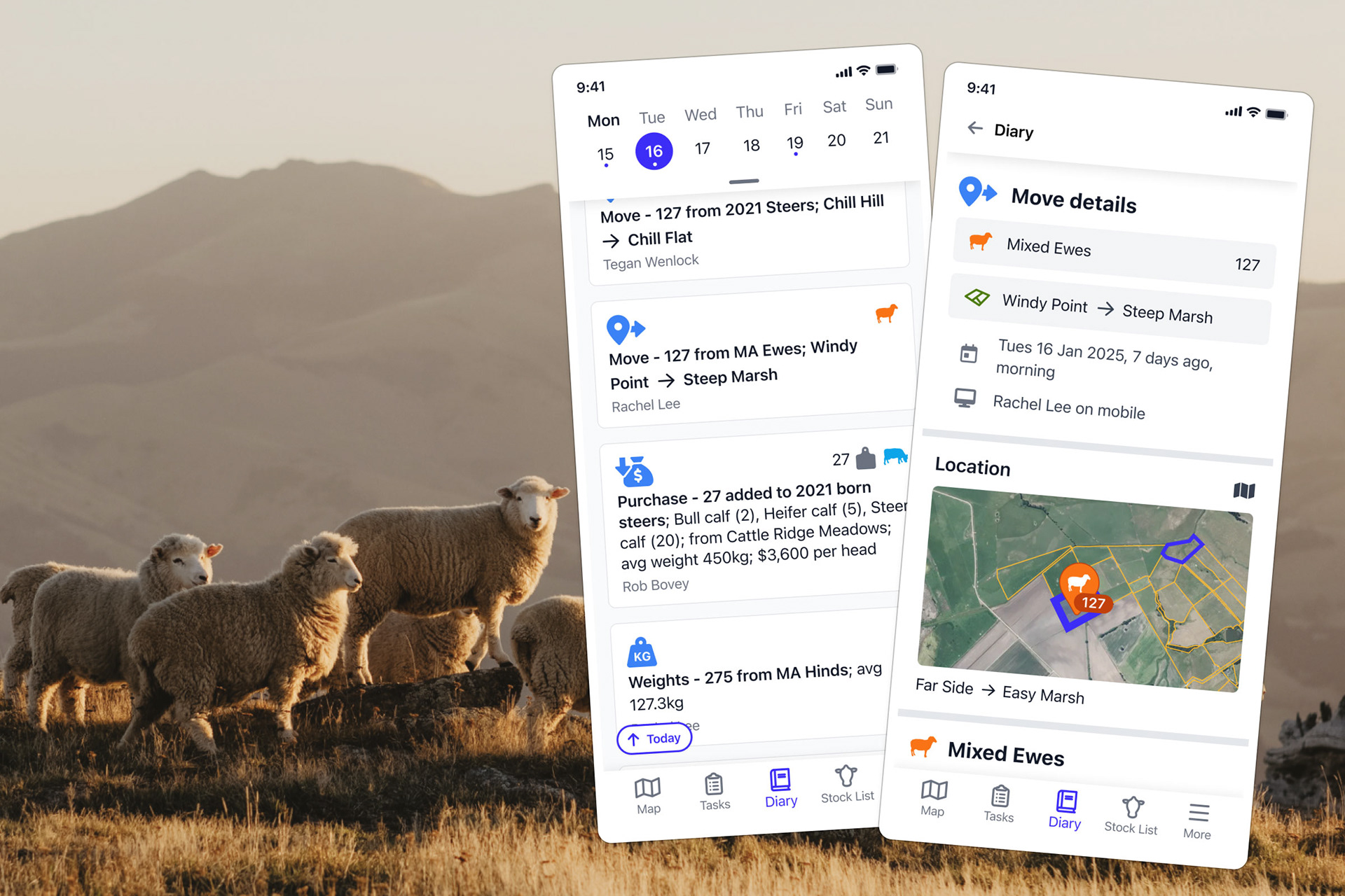
Quick access to historic stock movements helps farmers make smarter, more effective decisions regarding their farm’s health, profitability, and regulatory compliance.
• 50% increase in engagement on the IQ app compared to the classic.
• 25% decrease in views on the web, as farmers are increasingly viewing on the go.
• Clicking into events on the web will decrease by 20%, as farmers can find the information they need more quickly (on hover).
• The Stickiness of the IQ app (our guiding metric) increases by 5% because farmers are using the IQ app to view the diary every time they need to make a decision on the go in the yard/paddocks.
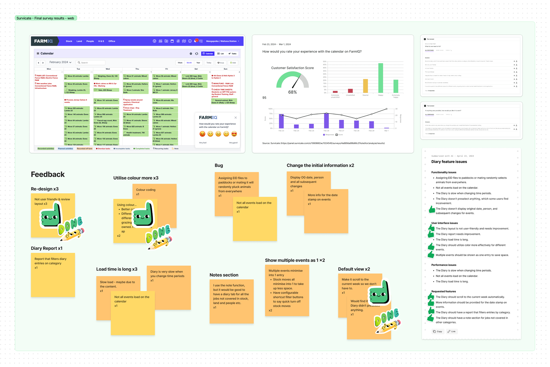
• The CSAT score on mobile is at least 70%.
• The CSAT score on the web is at least 10% higher than our baseline of 68%.