The Responsible Mindset, doesn't enjoy investing, they are risk adverse. They feel like they need to invest, so that they can do what is right and grow their money as much as they can for the long-term. Learn more about my part in Hatch's Money Mindsets here
Outcomes: deep-diving into user pain points with customer research, competitor analysis, user flows, UI designs, content creation, creating a consistent brand and measuring success.
Jargon and Self-doubt are BIG Barriers to New Investors
We wanted to increase the percentage of customers who invest regularly in the US stock market by lowering the barriers to entry for new customers. To achieve this, we first empathised with our customers by creating empathy maps and understanding their complete journey within our product. This helped us identify their pain points and develop solutions to ensure a smoother and more efficient process.
Below you can see the original experience and the highlighted area we chose to focus on improving. The user-friendly design lets our responsible and intrigued mindsets explore our content their way. We give them lots of options so they can choose how long they want to explore depending on their knowledge and confidence levels.
This content was bypassed by our planners and progressive mindsets as they don't want or need to see it.
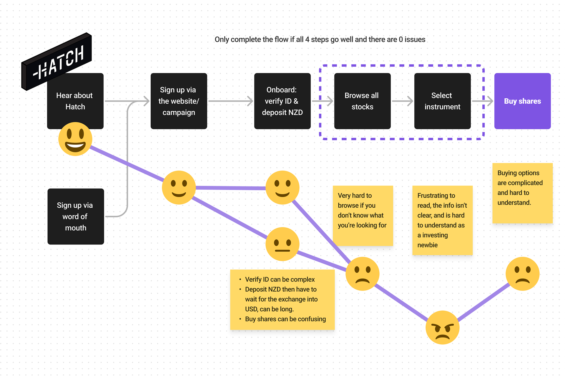
The original experience from signing up - buying shares
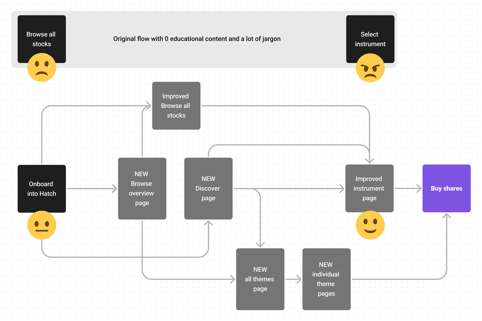
Our improved experience from browsing stocks - buying shares
Handholding New Customers Through Their First Investing Experience
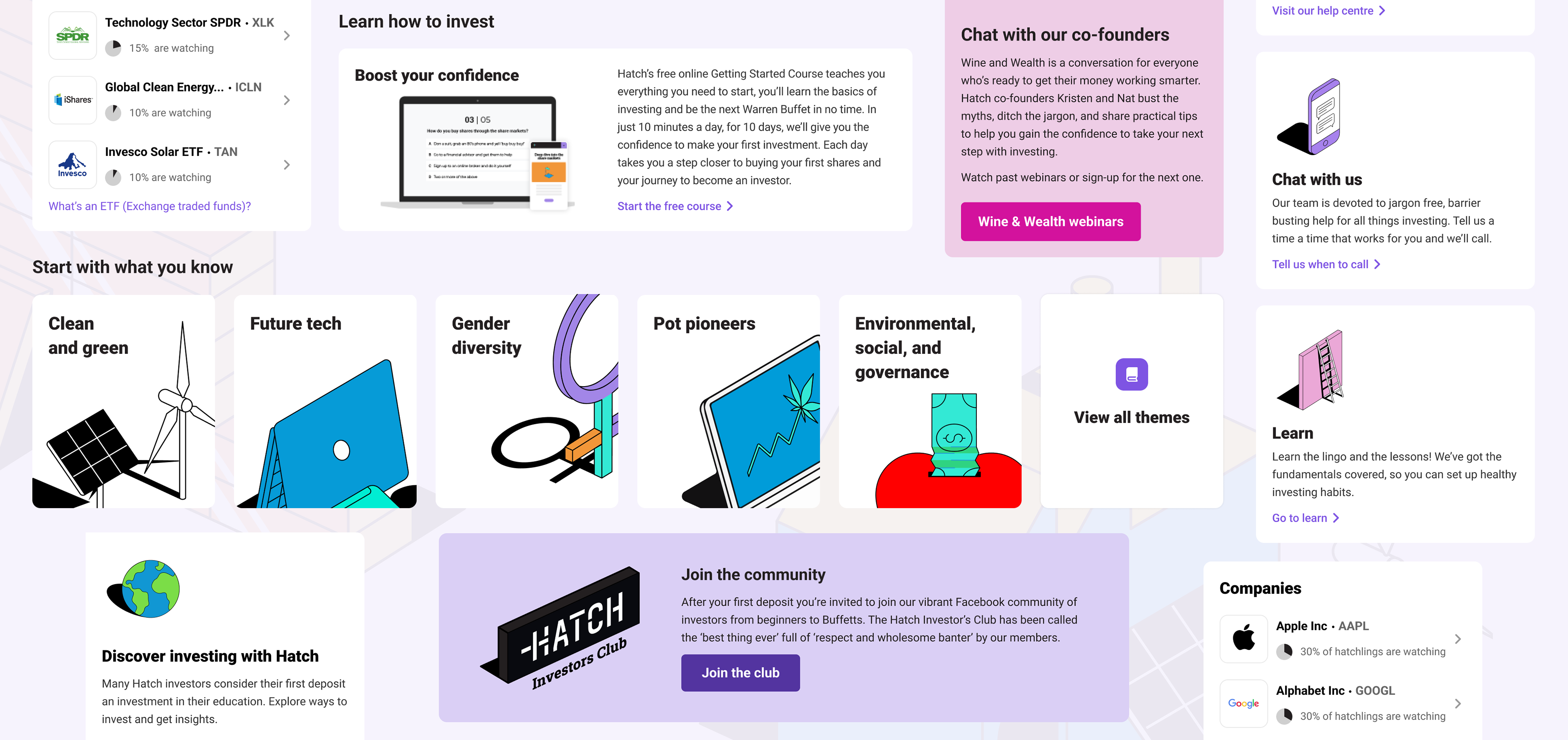
Our product lacked sufficient educational content, which was a simple problem to solve. While we had quality content on our website, such as engaging blog posts for customers. Once they signed up and entered the product, they were faced with a confusing array of investing options without any help content or explanations.
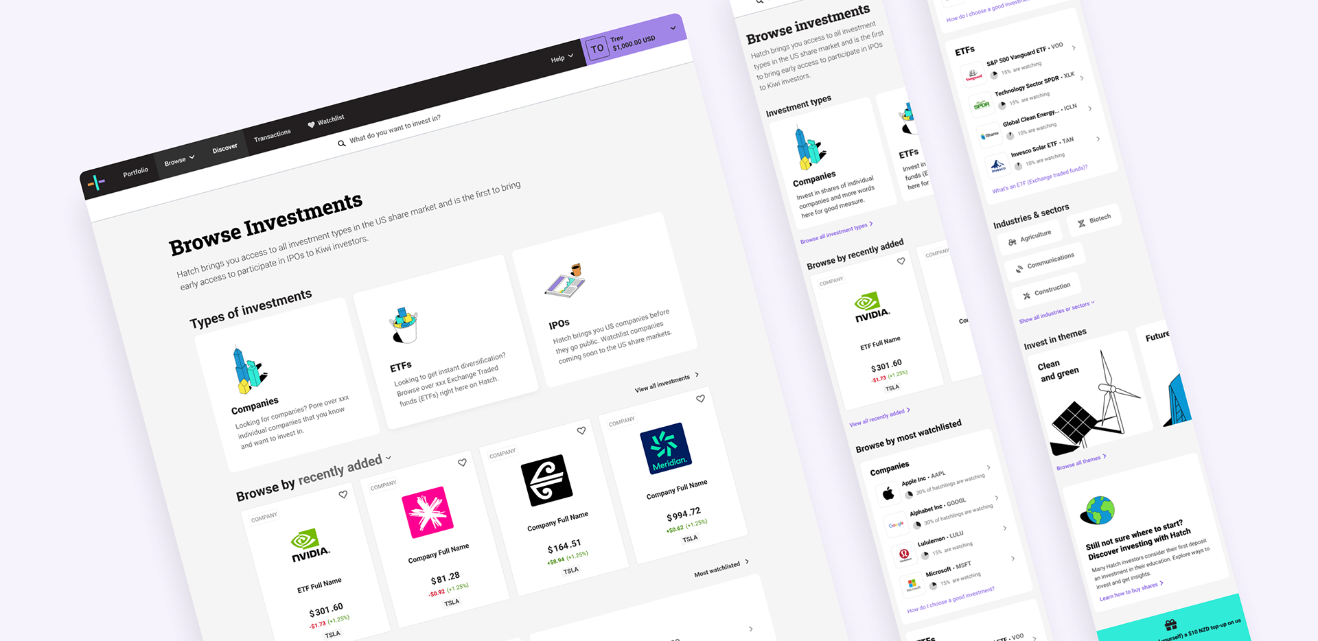
We started by creating a user-friendly page called "Browse Overview" for easy stock browsing. We categorized stocks into different investment types and offered customisable lists such as recently added, most bought, most sold, biggest gainers, and biggest losers.
We also provided data on the most watchlisted stocks by our customers, adding a layer of social proof to reassure our new Hatchlings.
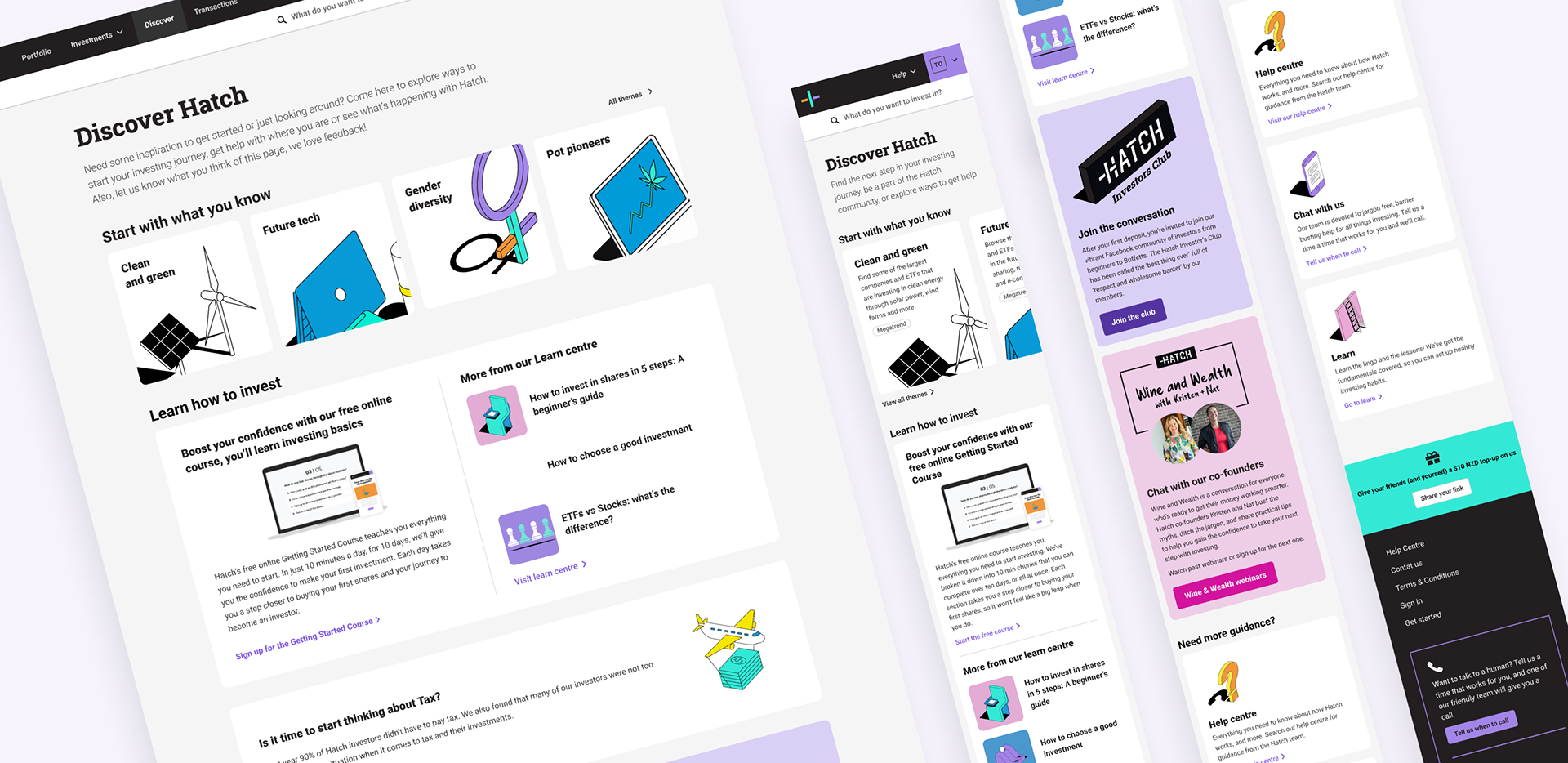
Discover Hatch
For those newbies who are complete novices to investing, we created the "Discover page", to bridge the gap between signing up and browsing stocks.
In this space, we provide educational information about stocks, including how to choose them, our recommended themes, upcoming events, multiple links to additional resources, and our popular free course for beginners. We update this section regularly and adjust the content based on the season.
Curated Stocks Into Themes for Those who Didn't Know Where to Start
Themes were created to assist those lacking confidence or knowledge to pick their stock to invest in by themselves. We created different themes, including an all-in-one page and individual pages, to help newbies browse the different options available.
Our team developed themes based on industry trends that our UX researcher investigated. Afterward, I analysed our customer data to identify our top companies and stocks. I combined these themes and created a rough draft of all the content, along with suggested word counts, in Google Docs. Our copywriter then refined the content. I uploaded the content to the admin portal for final pre-flight testing.
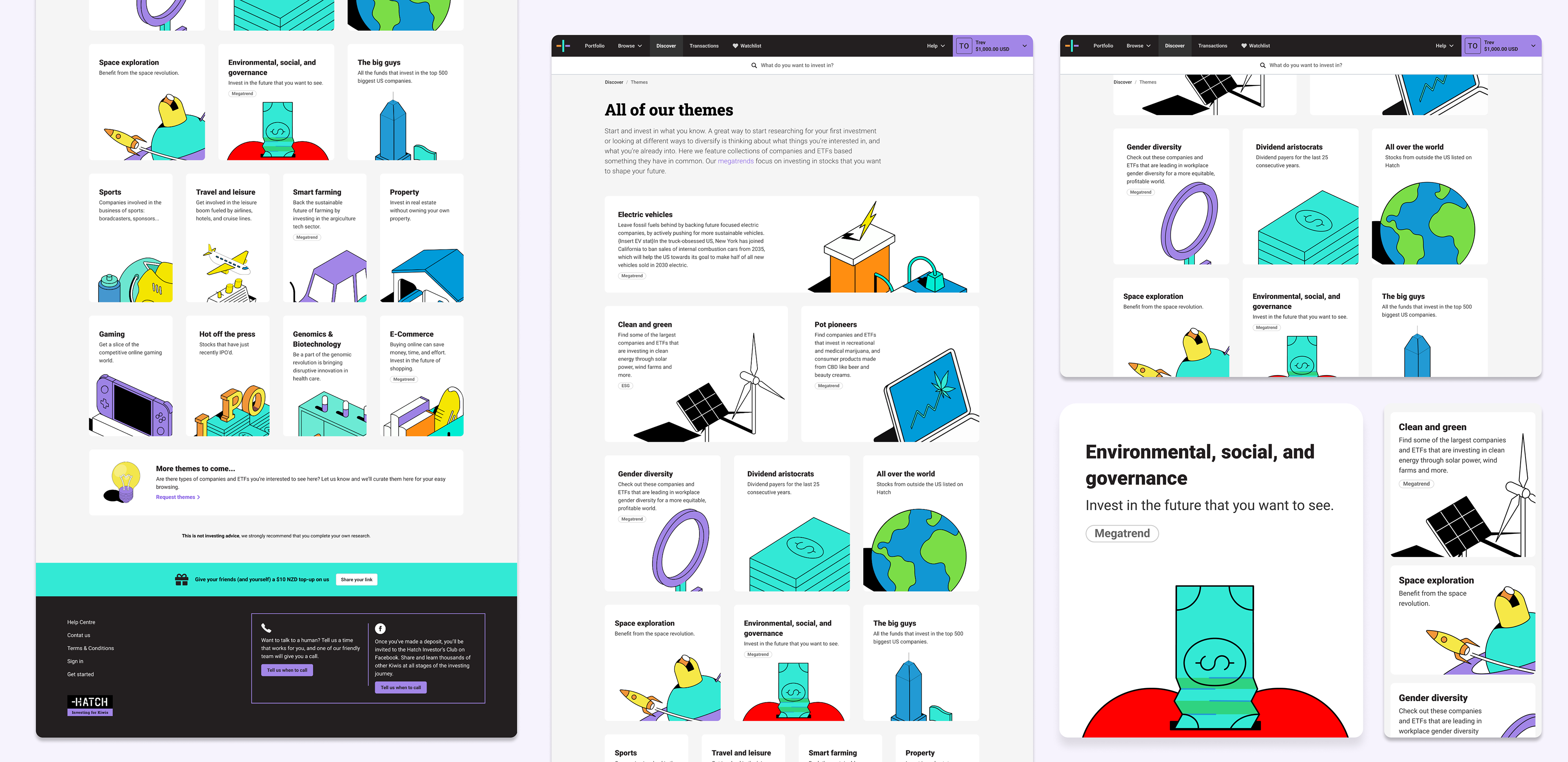
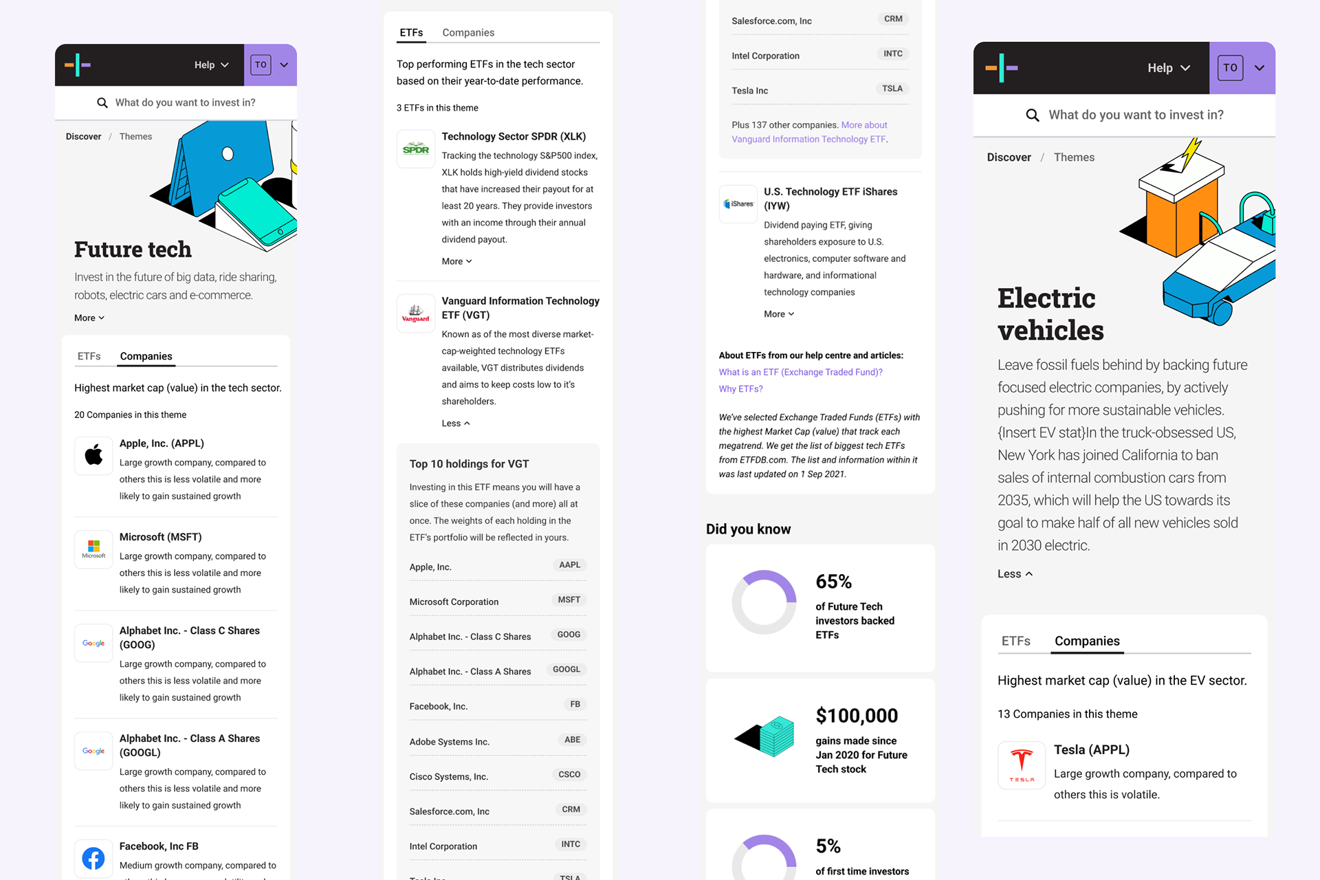
On the "Individual theme pages" we guided our customers through different stock selections, explaining why investing in these themes could help diversify their investment portfolio. The theme pages also featured social proof with actual data from other Hatch users' watchlists.
The themes on Hatch's website provided a toggle option for customers to compare investing in companies versus investing in an ETF. With just one click, customers could see the top ten holdings of an ETF. These pages were equipped with an admin view, which allowed anyone with access at Hatch to update the content as needed. This feature made it possible for the company to be flexible and responsive to current trends. In addition, these pages helped to improve the website's SEO.
One of the biggest challenges we faced during this discovery project was to create educational investing content that could not be considered investing advice from a legal perspective.
Updating our Stock Instrument (Buy Stock) Pages
We made some changes to our instrument page (a stock page, like Vanguard 500 Index Fund ETF: VOO) to improve the user experience for our investors. One of the changes we made was to add in-context help to guide new investors through the process. We also restructured the page to make it easier for expert investors to scan the content without being interrupted by helpful content.
These changes were our final steps to make investing less intimidating and more accessible for all users within our product.
Once Live
We tracked all customer interactions with these new pages in Intercom and saw a steady increase over time of new customers going from Step 1: Signing up to Hatch - to Step 5: Buying shares. We also saw a steady decrease in customers who signed up and left the buy funnel and never returned to Hatch.
By regularly reviewing the usage data we could update content on the "Browse Investments", "Discover Hatch" and "Theme" pages to keep our product fresh and up to date with relevant information that kept our customers engaged.
Work completed whilst at Hatch