🌟 Summary of Outcomes
Scaled consistency: Reduced pattern drift; aligned product + marketing on one shared visual language.
Increased velocity: Teams shipped faster with reusable parts, clear guidelines, and fewer review cycles.
Improved quality & accessibility: Tokens and foundations raised the baseline for contrast, spacing, and behaviour.
Created organisational alignment: Designers, engineers, and brand working from the same principles and source of truth.
Established a mature system: Governance, contribution, versioning, release cadence, and adoption rituals embedded into delivery.
🧭 Why We Needed a System (Not Just Libraries)
Multiple libraries and patterns were drifting apart, creating inconsistent UI, duplicated effort, and brand debt.
Teams lacked a single source of truth and clear decision principles, slowing reviews and delivery.
Marketing and product were making parallel choices without a shared foundation.
Leadership action: I reframed this not as a tooling issue, but a system problem involving governance, adoption, and shared standards. I aligned stakeholders around a North Star of delivery speed, consistency, and brand coherence.​​​​​​​

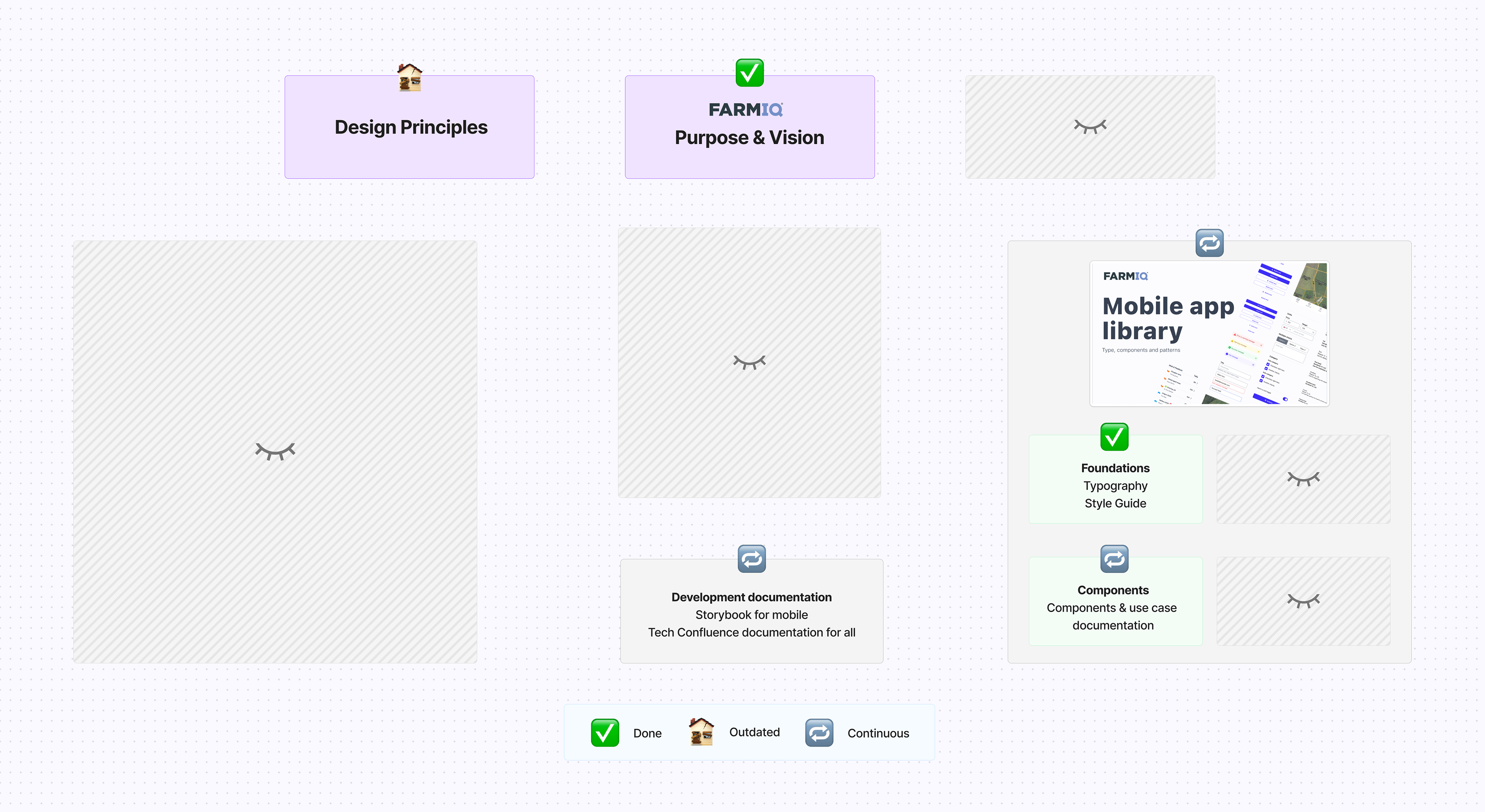
Depicts the state of the Design System when I joined FarmIQ.

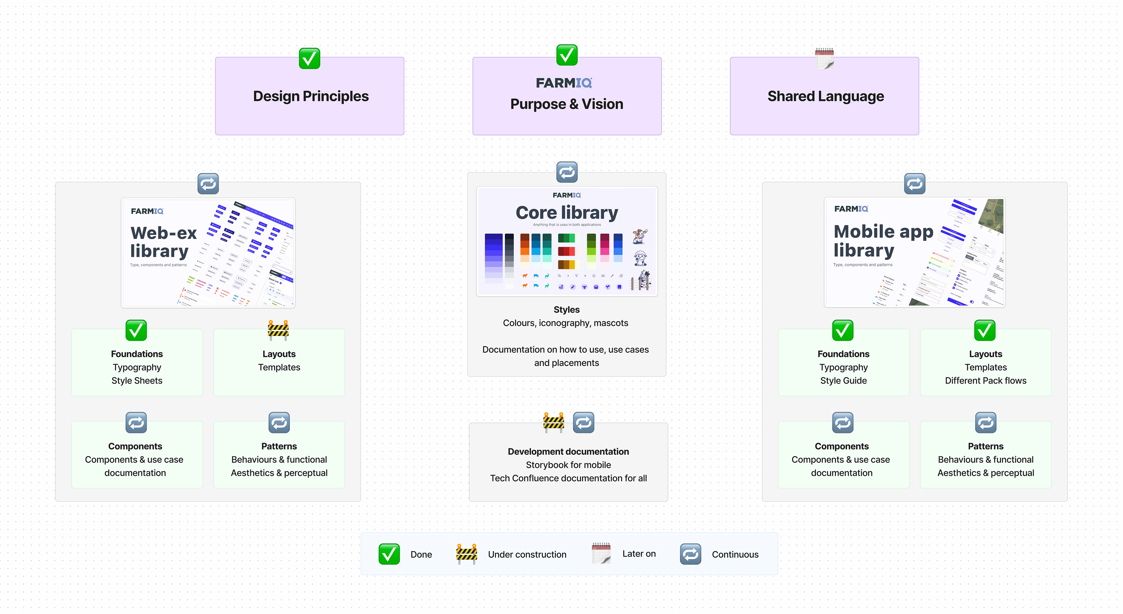
Design System state when I left FarmIQ.

🏗️ What We Built (Operating Model + System)
Design Principles & Direction
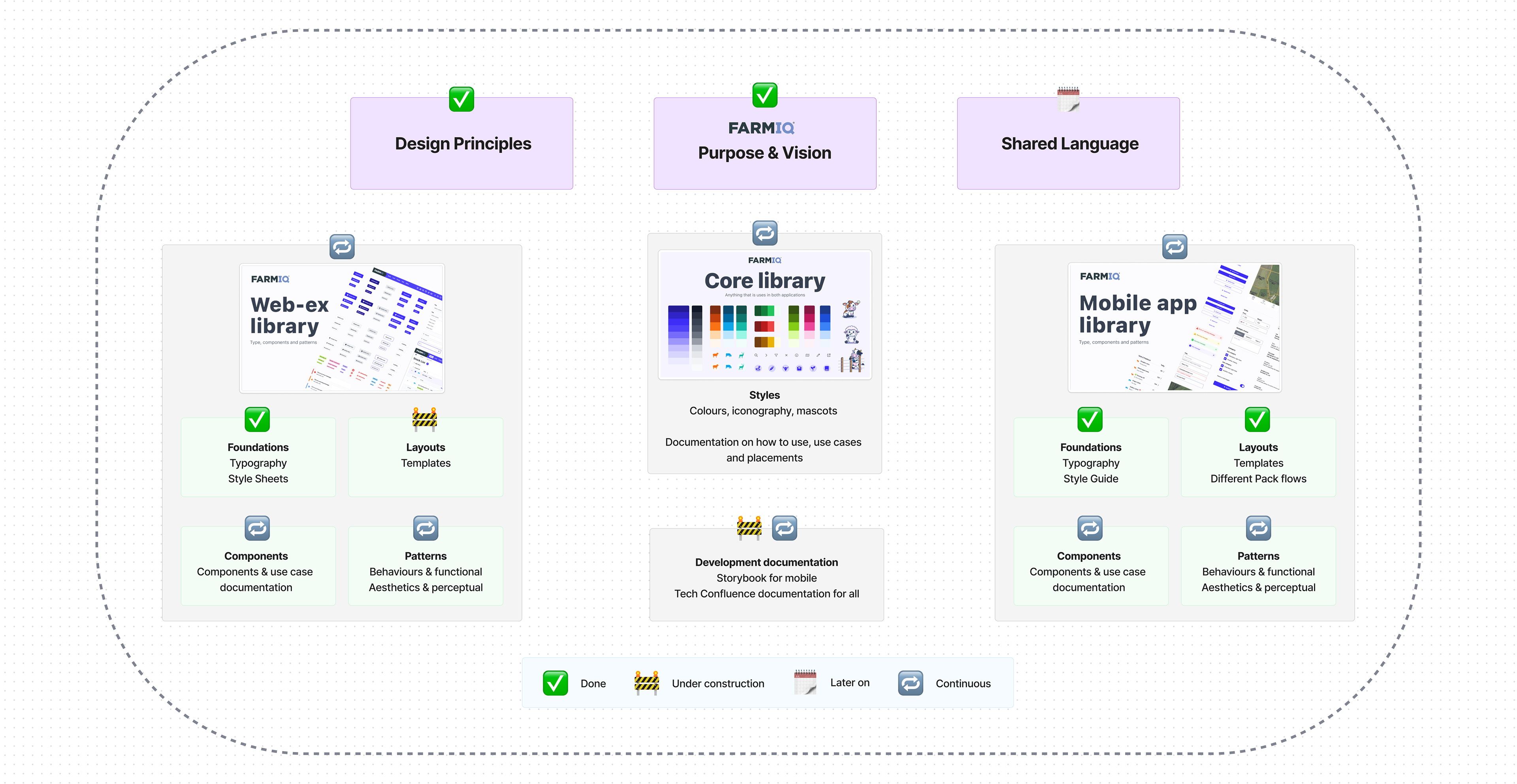
Turned strategy and brand intent into principles that resolve debates and guide decisions.
Foundations → Tokens
Established colour, type, spacing, elevation, and motion as tokens (with WCAG accessibility baselines baked in) to ensure consistency across platforms.
Cross‑Platform Components
Built a structured component set for core flows (inputs, tables, navigation, dialogs, status & validation, content presentation) with usage guidance, states, and variants.
Governance & Contribution
Defined versioning, release cadence, review gates, and a contribution path so teams can add with confidence, and we keep quality high.
Adoption & Enablement
Introduced Design Jams, office hours, and short how‑to guides; created migration guidance so existing work could be uplifted without blocking delivery.
Outcome: The design system became the operating system for delivery. It's clear rules, reusable parts, and a shared language across design, engineering, and brand helped us deliver at speed.

🚀 How We Rolled It Out
Inventory & rationalise → audited libraries and merged patterns to eliminate duplication.
Pilot → expand → piloted in one product area, then expanded across web and mobile.
Embed in planning → linked system improvements to quarterly planning so migration happened with delivery, not after it.
Close the loop → implemented lightweight feedback and contribution processes.

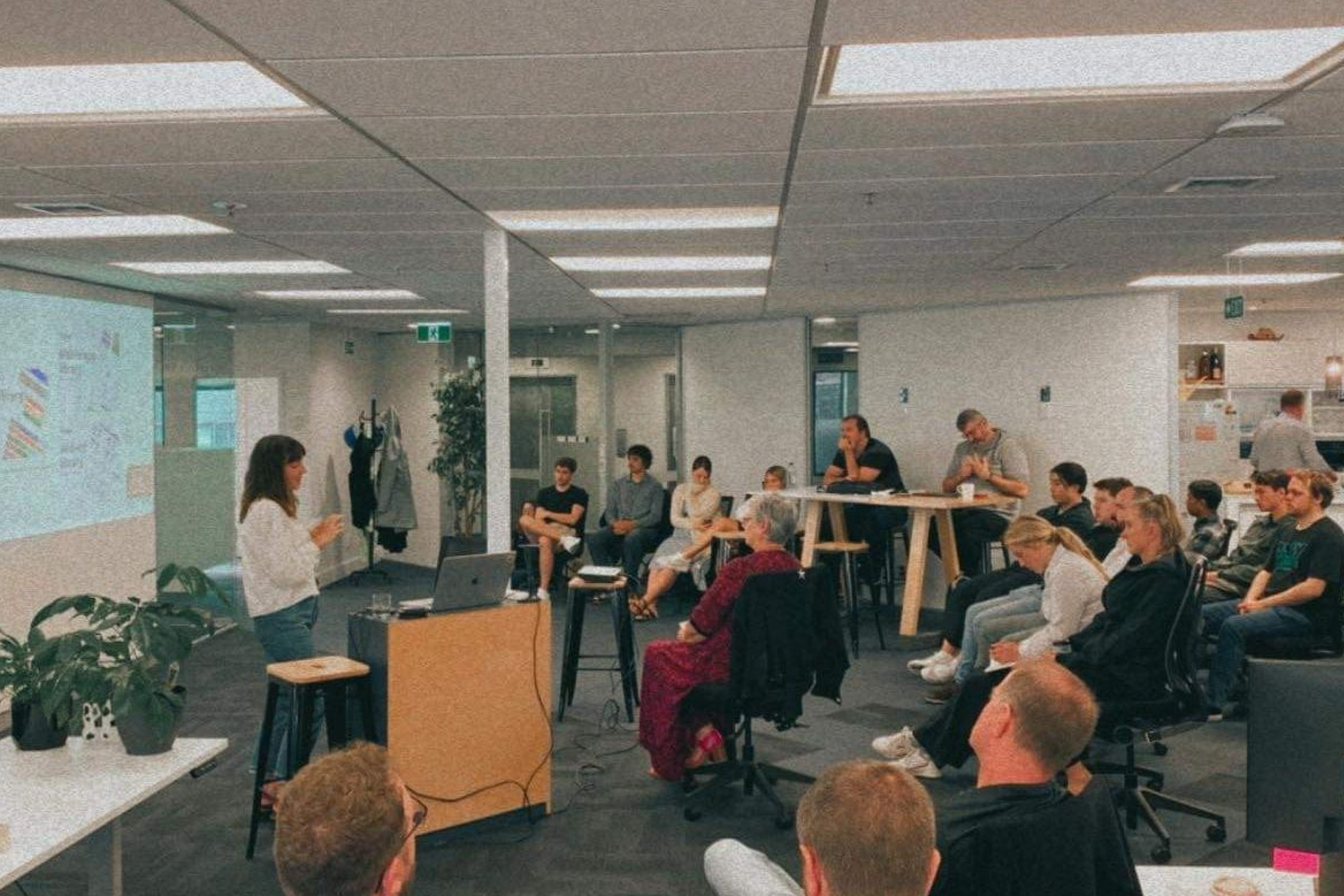
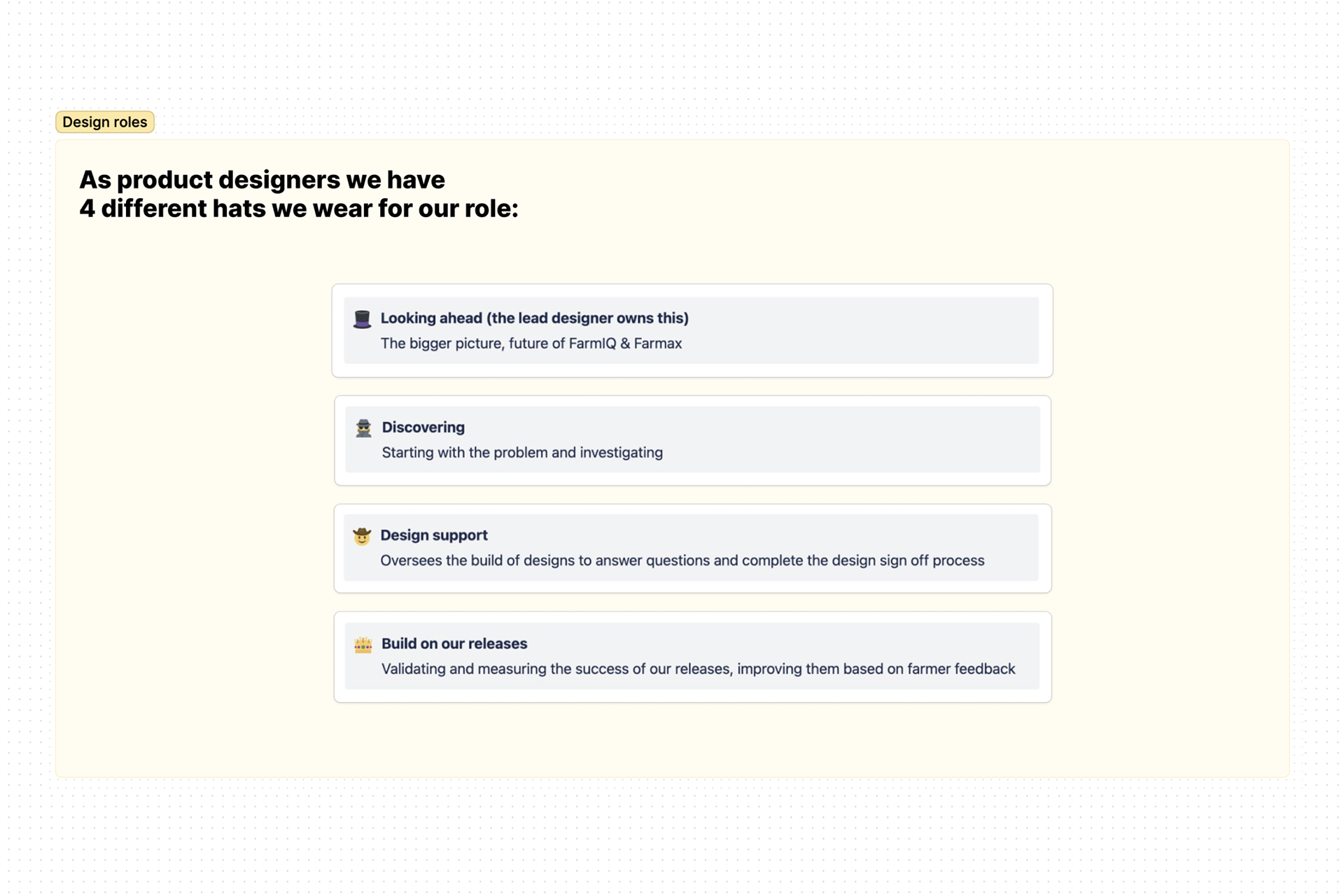
Education moment: Our Design System & how to use it

What the Design Team needs from the rest of Product

📈 What Changed (Outcomes)
Consistency: Fewer pattern variants; clearer guidance; tighter brand expression across product, website, and marketing.
Velocity: Teams ship faster by composing from proven parts; less rework and fewer review cycles.
Quality & Accessibility: Foundations and tokens raised the floor—contrast, spacing, and states are consistently applied.
Alignment: Engineering, product, and brand now use a single source of truth and the same decision principles.
🖼 Selected Evidence
Core Library → System Foundations
From brand palette and type scales to platform‑ready tokens.
Web Experience Library (Product)
Reusable components and patterns with guidance.
Mobile App Library
Mobile‑first adaptations of core patterns.
Before / After UIs
Screens migrated from ad‑hoc patterns to system components.

Governance / Contribution Model
Release notes, versioning, and contribution flow.

Updated Design Principles became our decision‑making shortcuts — helping the team design, review, and validate faster with shared clarity.

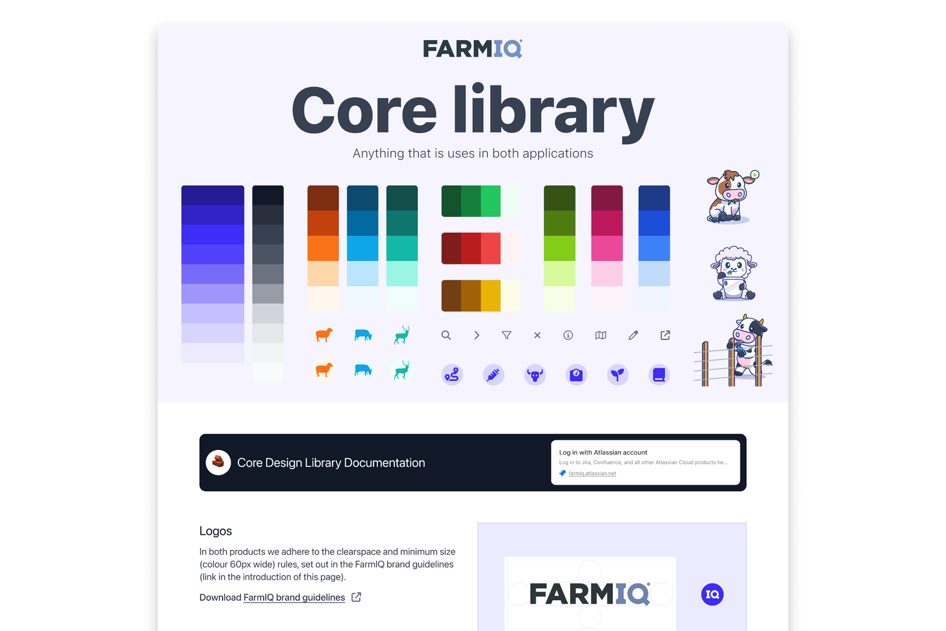
Our Core Library: foundations that standardise colour, iconography, and shared assets, creating the building blocks for a cohesive, scalable design system.

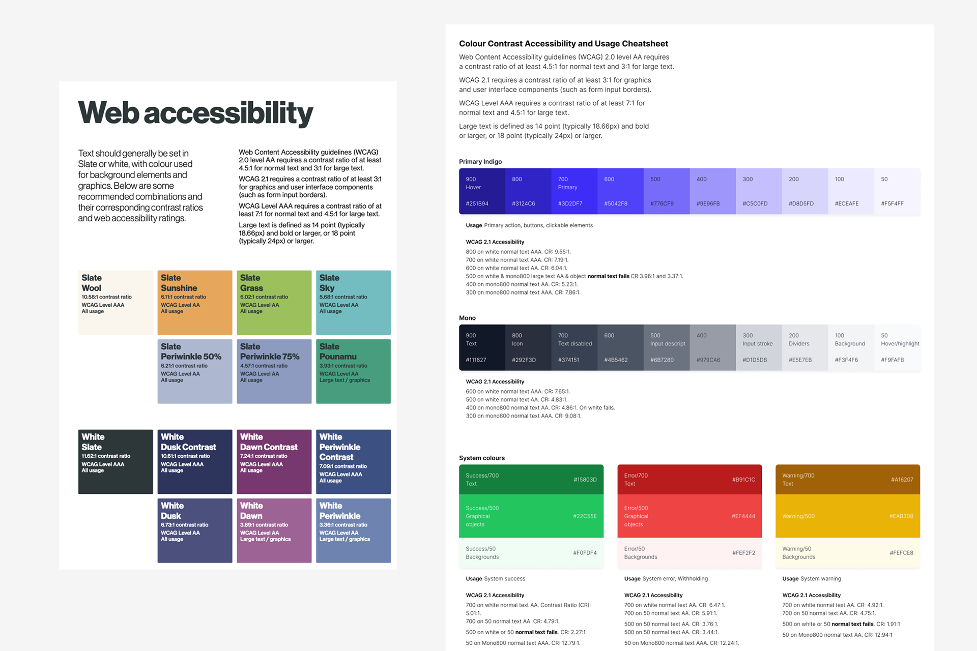
Accessibility‑driven colour tokens that standardise contrast, usage, and decision‑making across the product—lifting consistency and ensuring WCAG compliance at scale.​​​​​​​

Core library documentation that unifies design, product, and marketing through shared standards and accessible foundations.

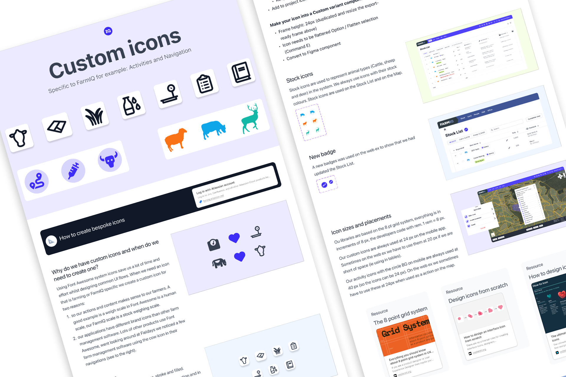
Iconography rules and guidance that help designers apply a cohesive, accessible, and scalable visual system.

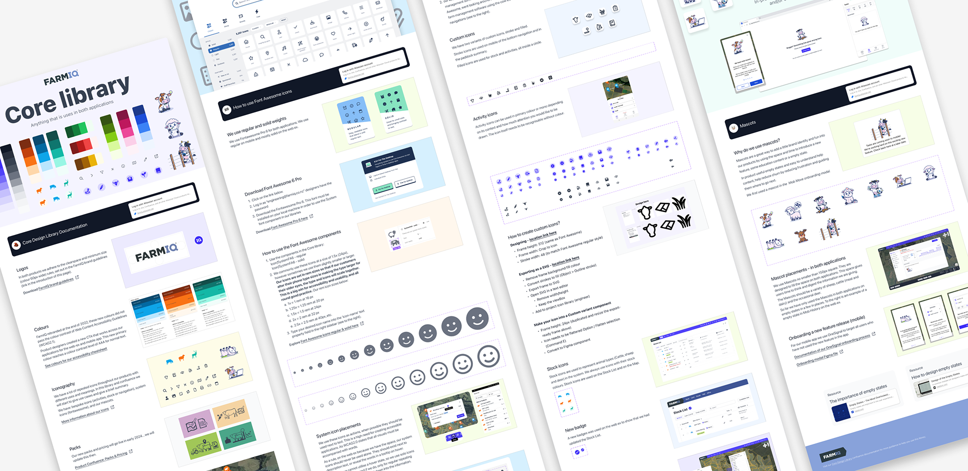
The full Core Library

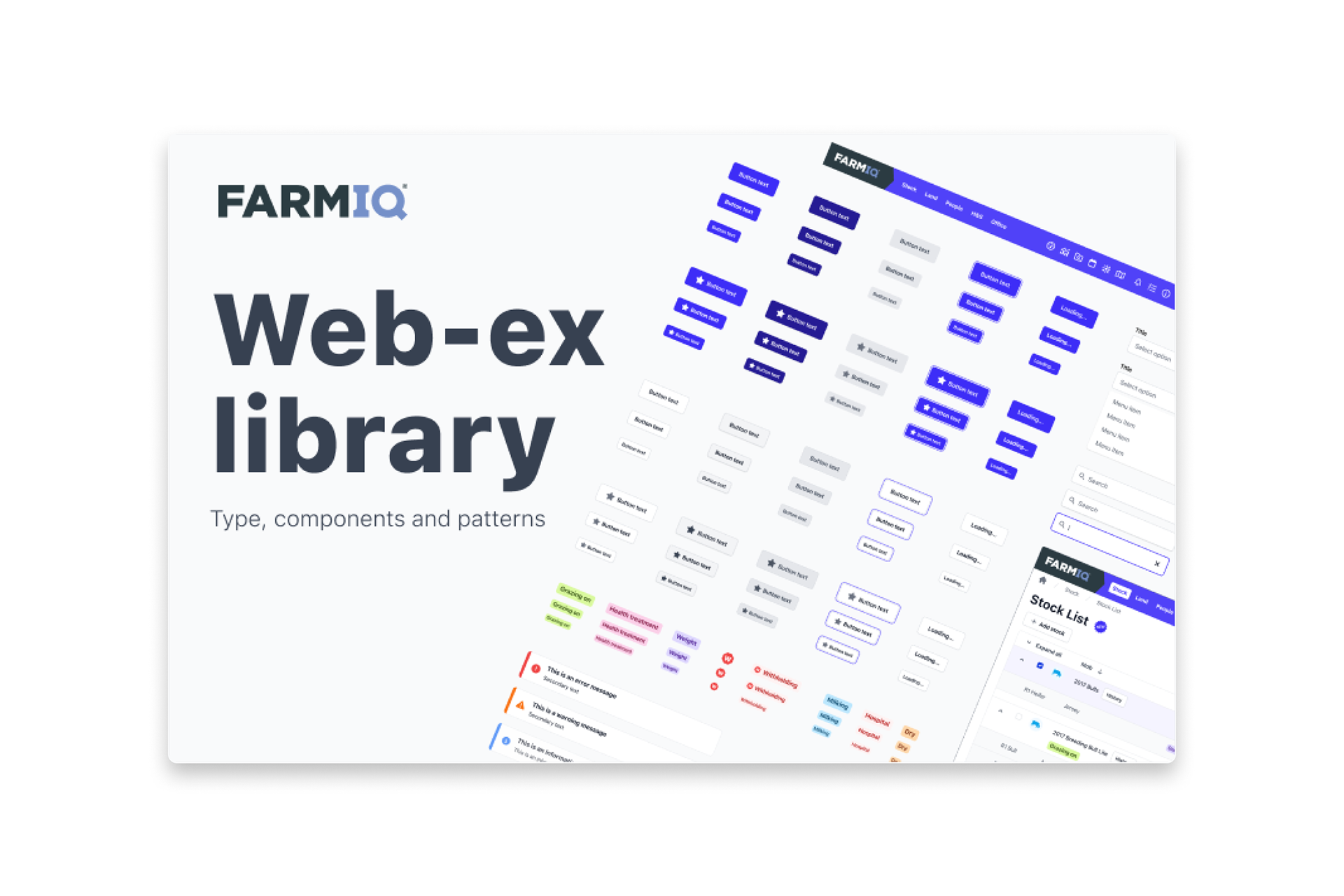
Our Web Experience library

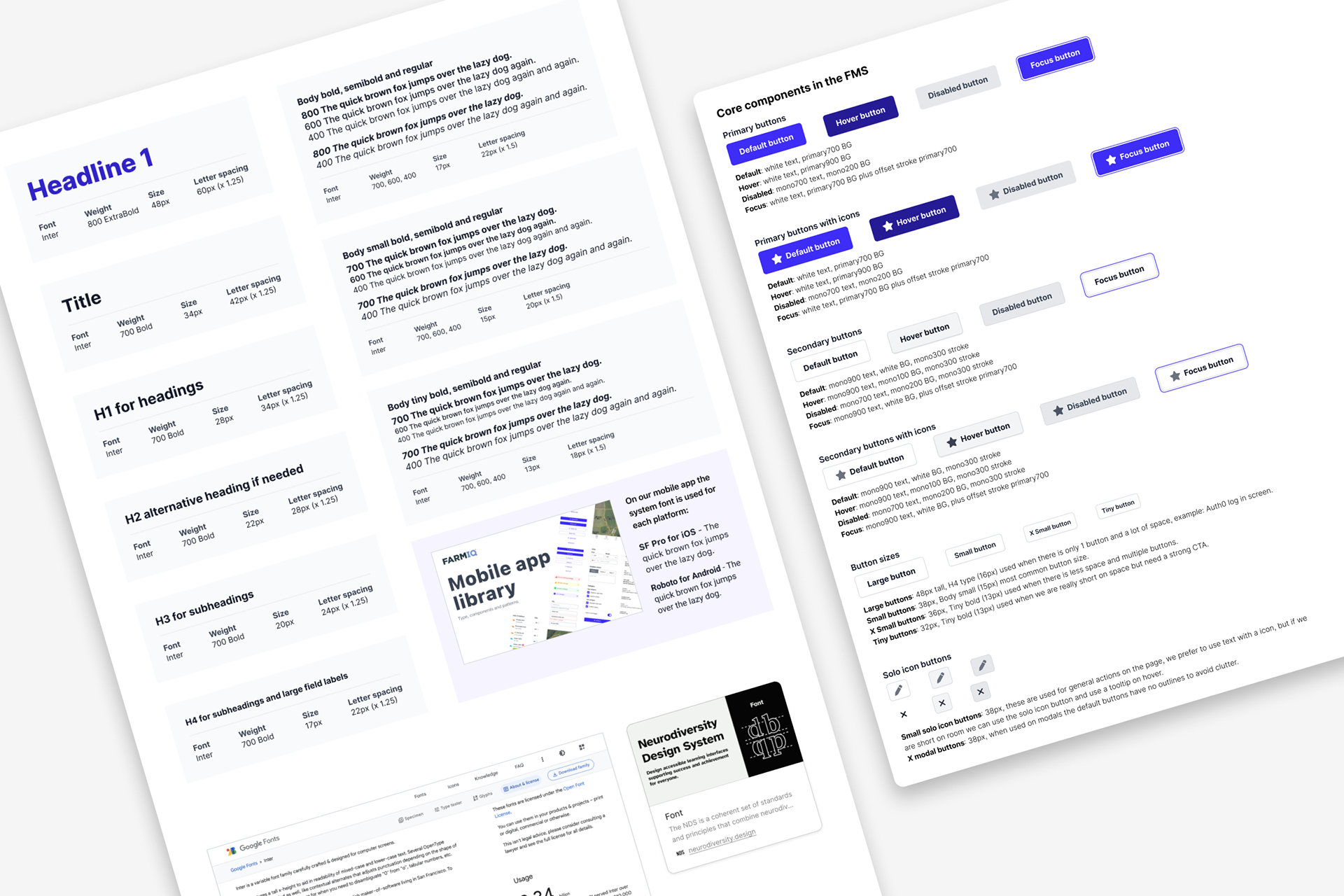
Web component set with states, variants, and usage guidance to reduce ambiguity and rework.

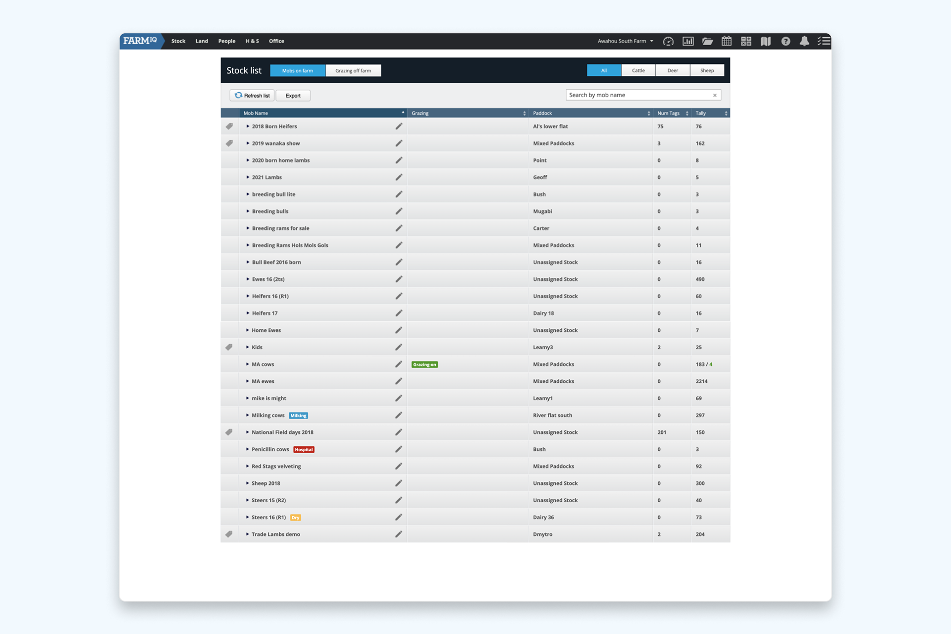
Web application before aligning with our updated brand

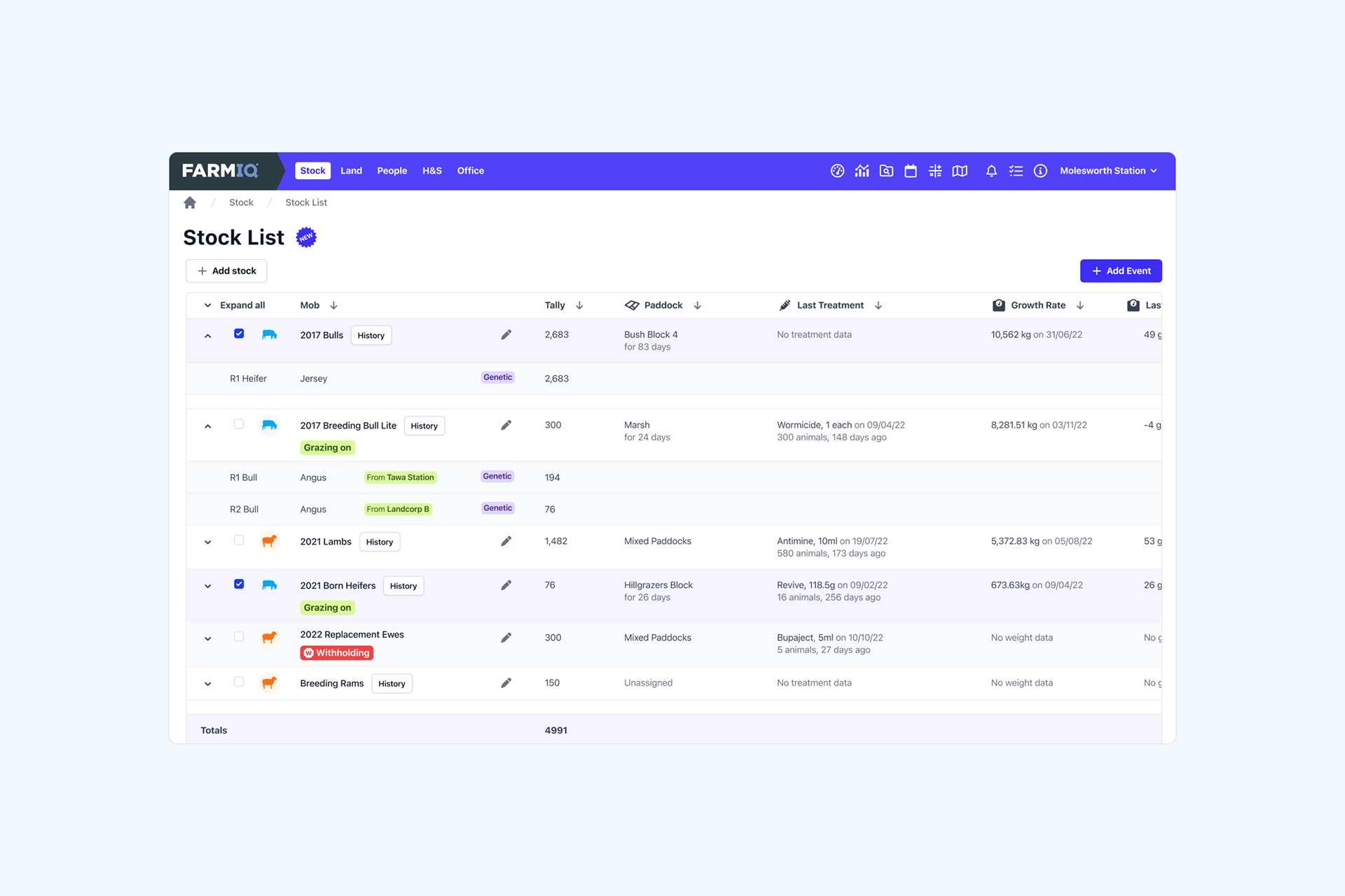
Web application after we have aligned with our updated FarmIQ & Farmax brand

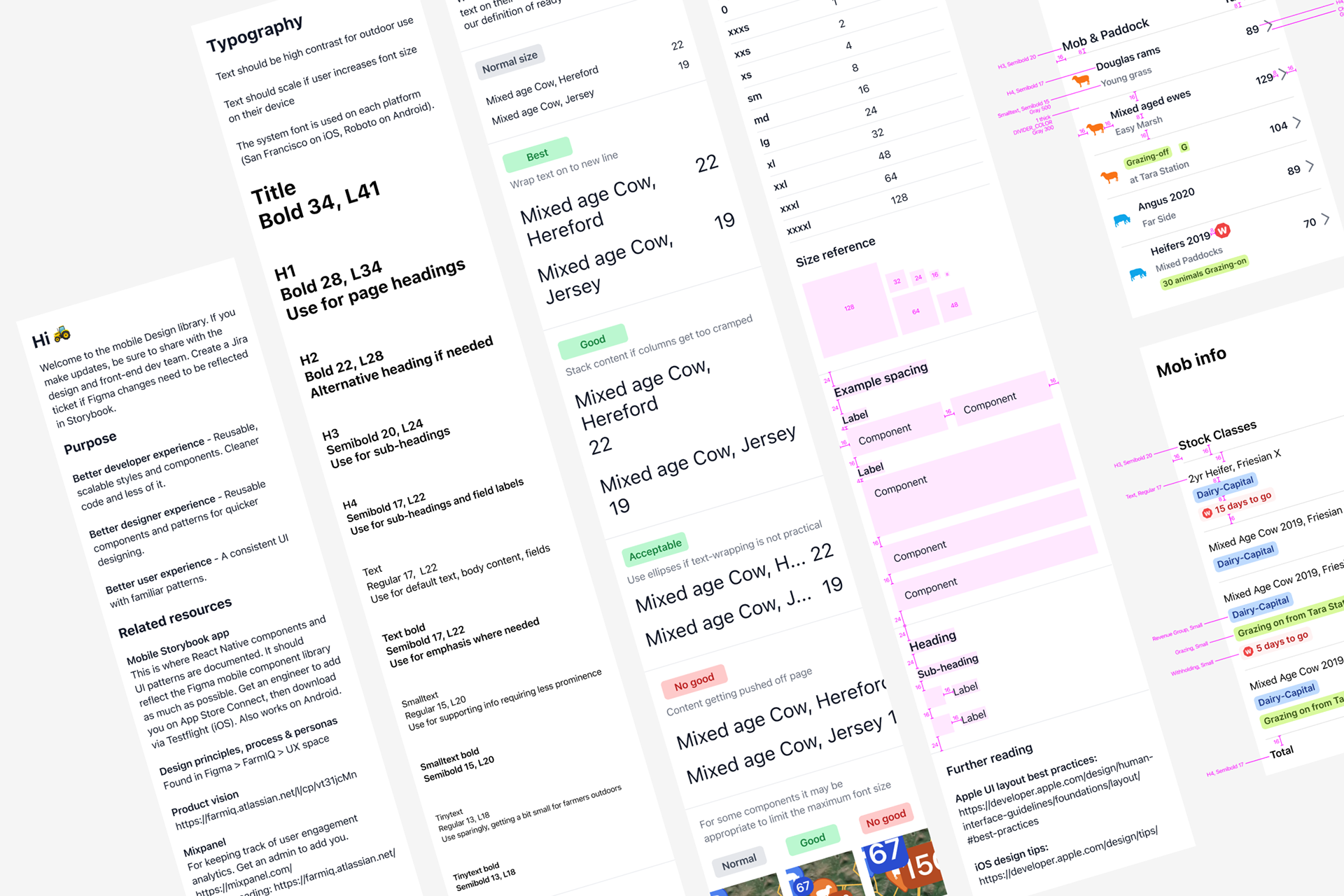
Detailed mobile typography and component specifications that standardise how designers apply hierarchy, spacing, and interaction patterns—improving consistency and reducing ambiguity across screens.

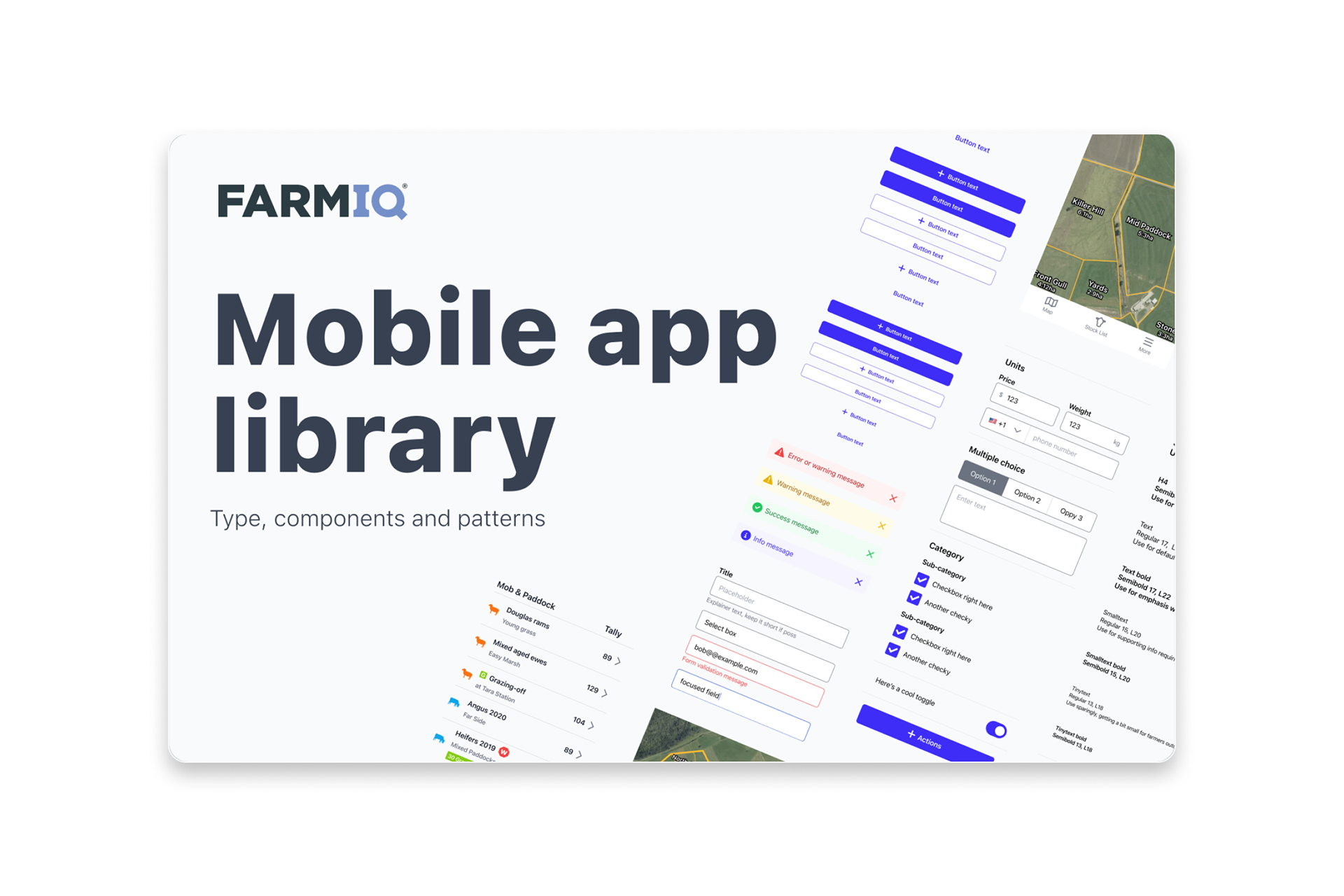
Our mobile app component library—platform‑ready patterns aligned to tokens, ensuring cohesive, scalable, and high‑quality mobile experiences across the FarmIQ product suite.

📚 What We Learned
A design system succeeds when governance and adoption are solved. Nnot just component quality.
Tokens and principles reduce debate, accelerate decisions, and scale quality.
Migration sticks when it’s planned alongside delivery, with resourcing and adoption rituals.
A design system becomes the operating system for delivery when the whole company participates in its evolution.
Work completed whilst at FarmIQ
Back to Top