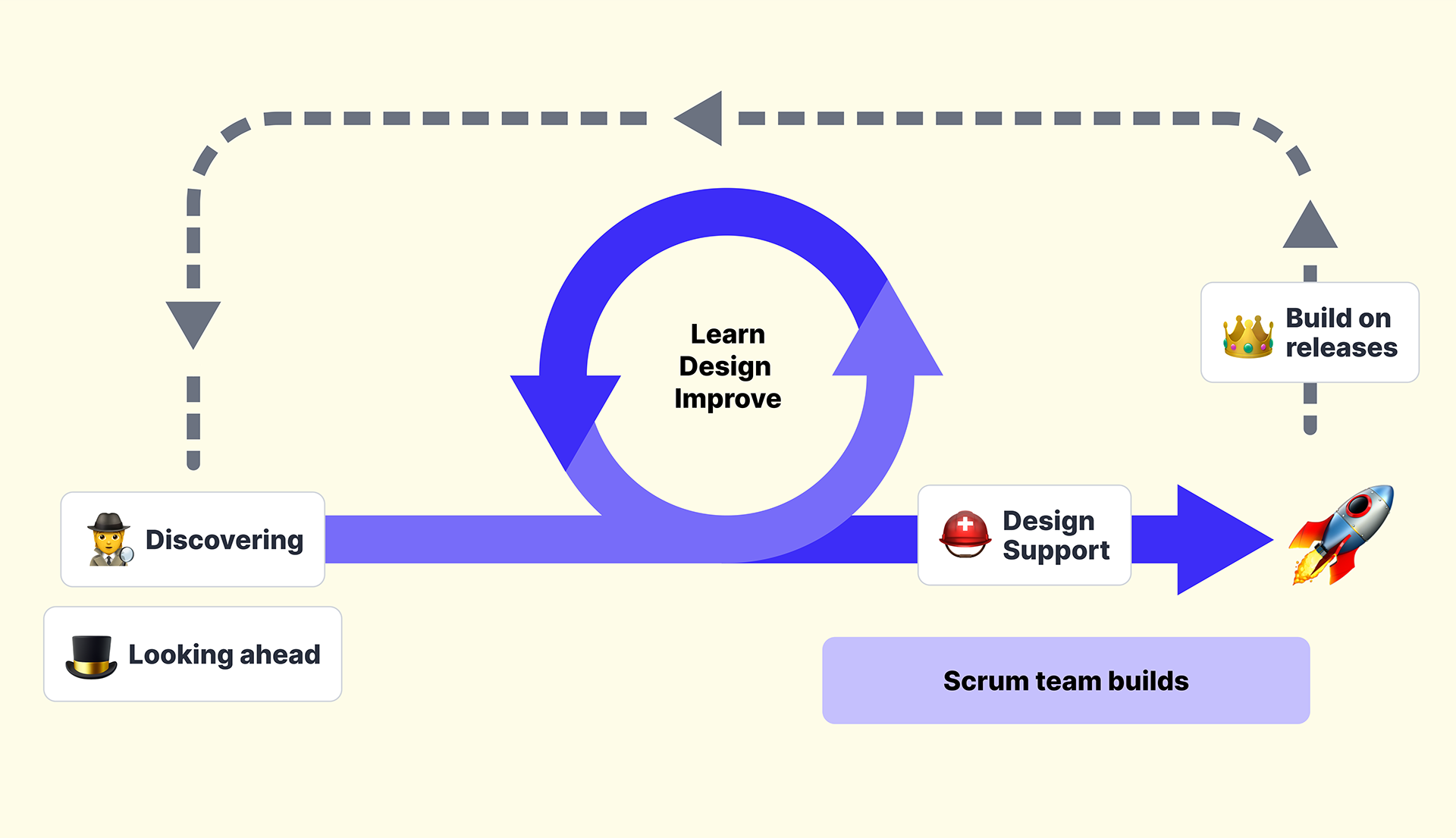
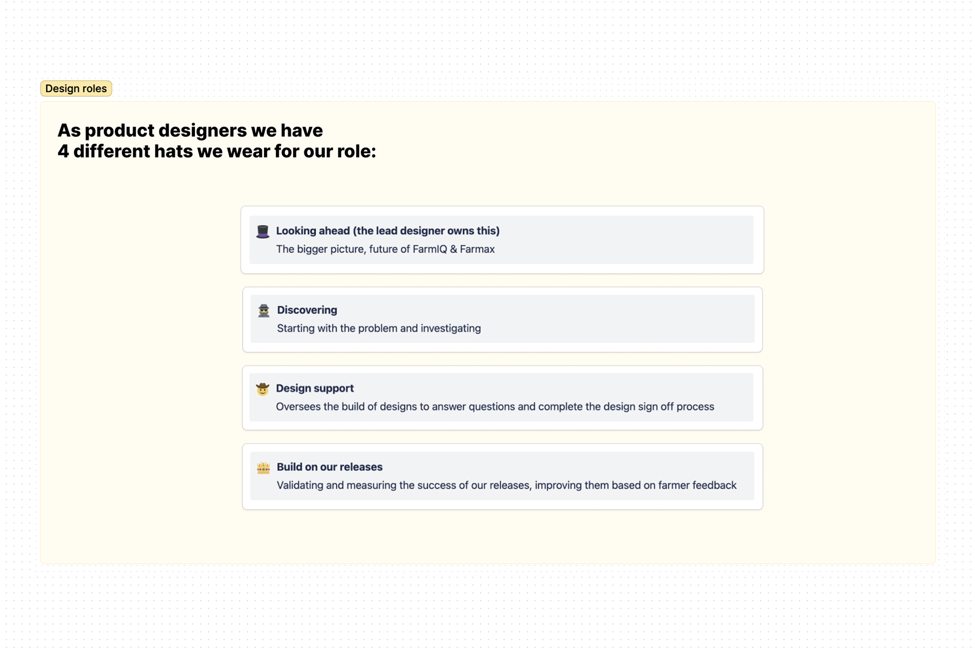
We reduced reactivity by strengthening our discovery rhythm, minimising design support, and creating a repeatable ‘build‑on‑releases’ loop that helped us learn and improve with every season.
Really measuring our success and improving solutions with feedback, saw an increase in CSAT and NPS scores, season-on-season.
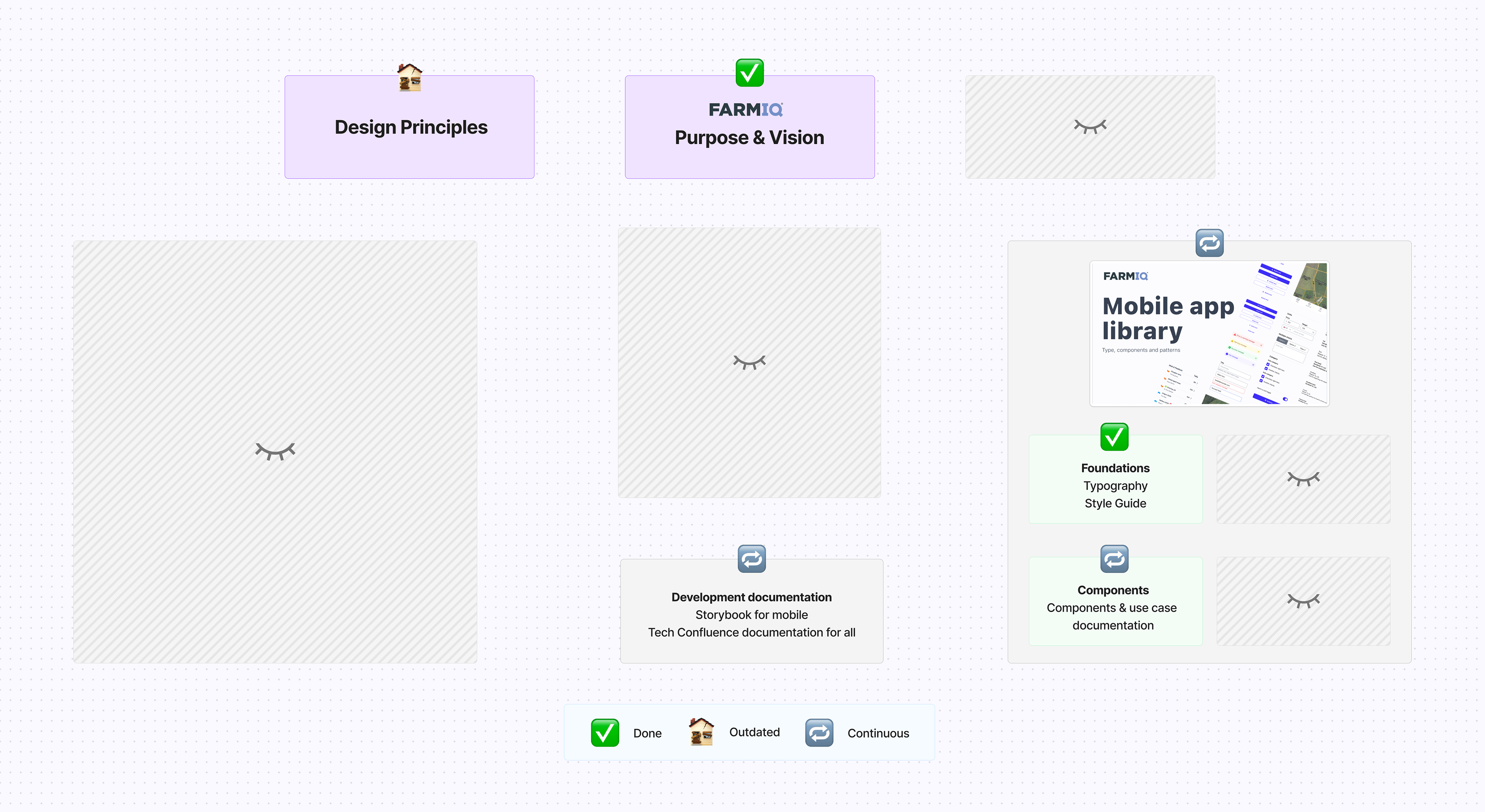
Depicts the state of the Design System when I joined FarmIQ.
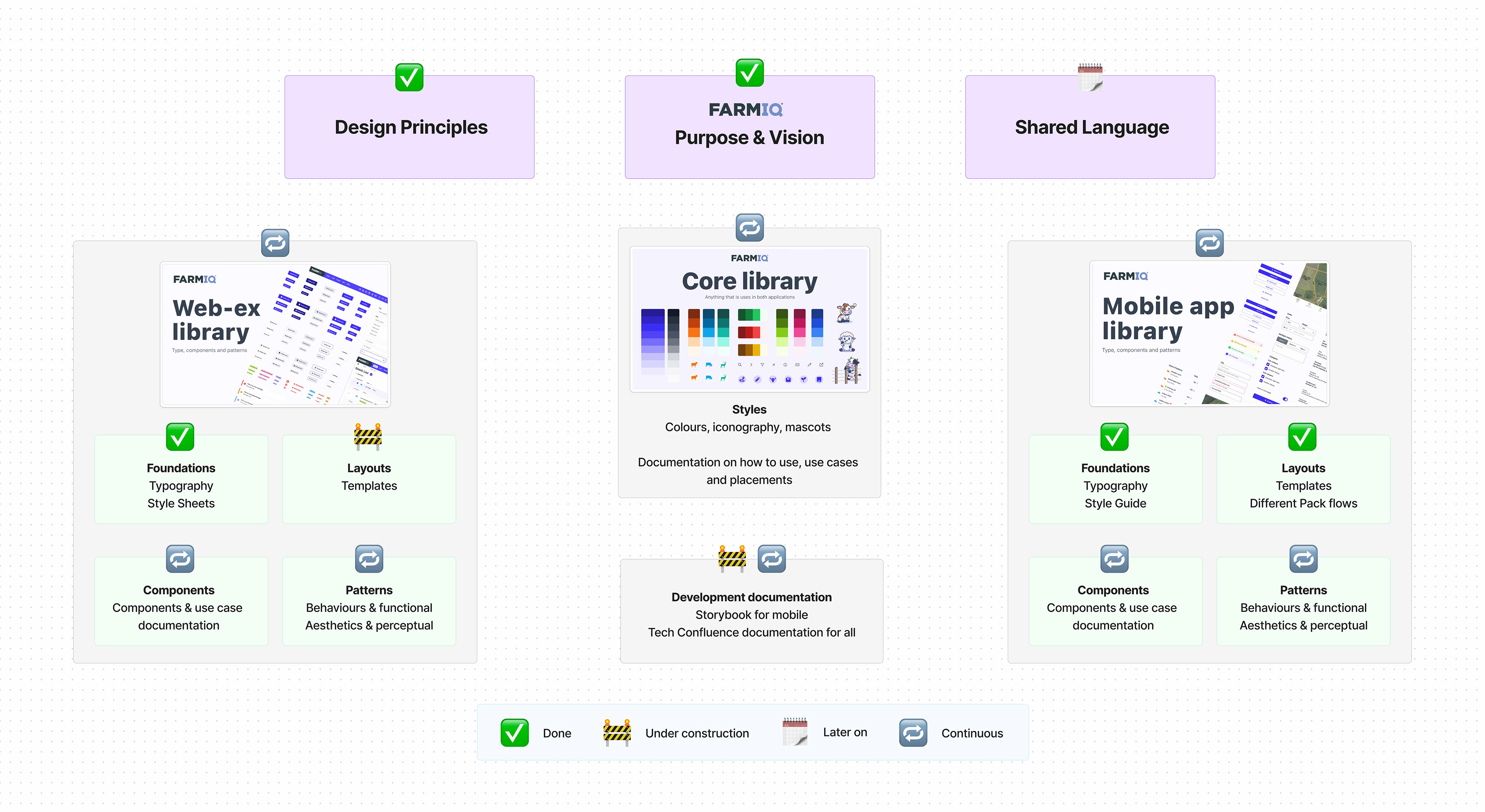
Design System state when I left FarmIQ.
We co‑created a Design Team Charter defining mission, roles, values, collaboration agreements, and measures. I translated the company's strategy into a concise design narrative and principles (clarity, consistency, resilience) that resolved debates without looping around the same discussions. The Team Charter and Design Principles became the lens for design reviews, experience vs build trade‑offs, and roadmap conversations.
I led a refresh of our customer understanding through research. Every interview began with consistent “farmer introduction” questions, and each session produced a farmer‑on‑a‑page summary. With SMEs, we co‑created role definitions across farm owners, farm managers, stock managers, workers, and third‑party users, and paired them with Jobs‑to‑Be‑Done to focus on outcomes that matter (e.g., record fast in the paddock, make confident decisions on-the-go). We also acknowledged technology‑adoption differences to understand when mobile‑first simplicity was non‑negotiable.
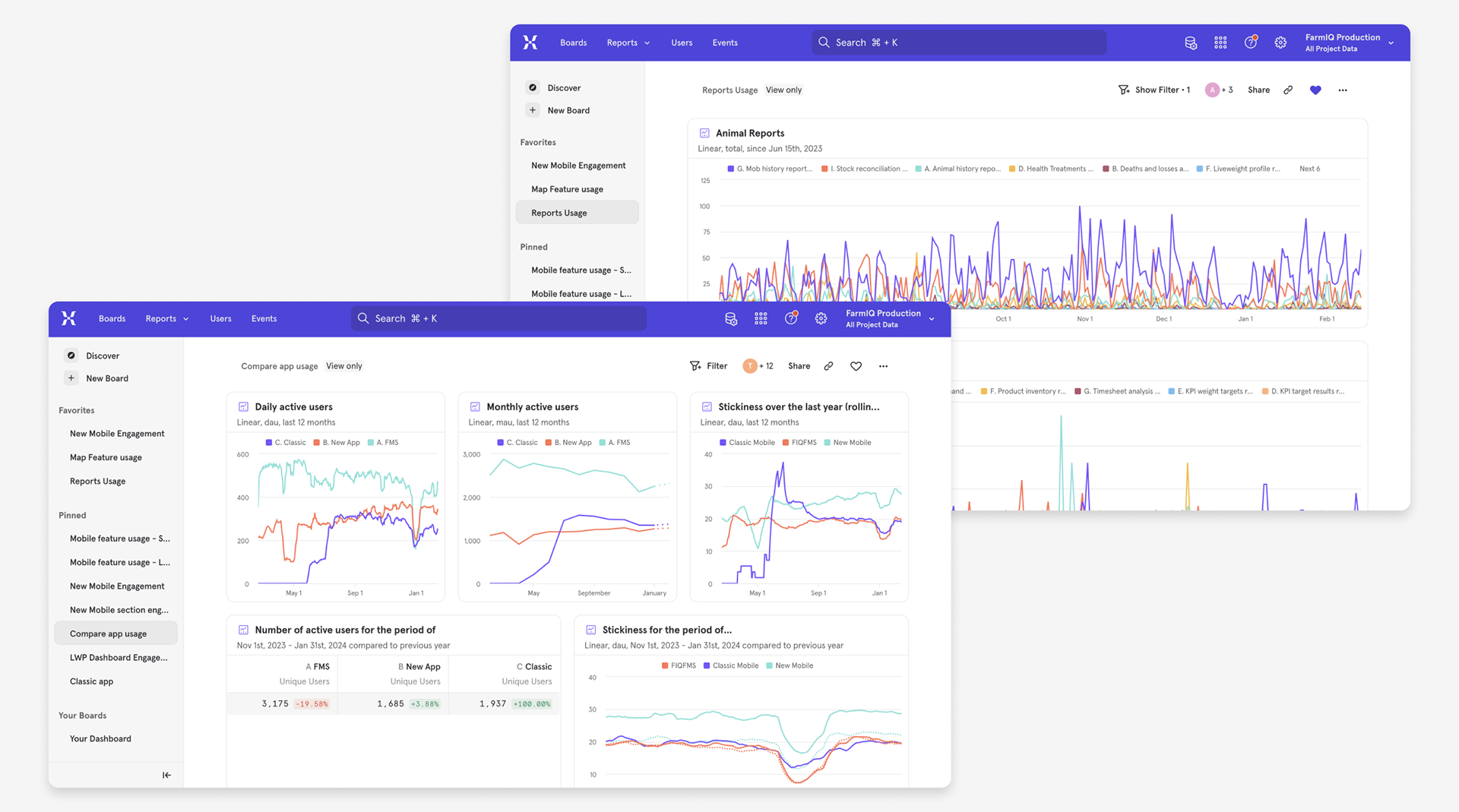
To learn quickly from all roles (including hard‑to‑reach workers), I introduced in‑product surveys across web and mobile. We saw 75–80% completion on targeted pulses, and ~80% CSAT for mobile recording flows; insights fed straight back into iteration and prioritisation. This qualitative insight, alongside our quantitative analytics, helped us measure the success of released solutions and prioritise building on them when needed.
I led the evolution from fragmented design libraries to a governed Design System co‑owned with engineering. We audited components and behaviours; defined system architecture (foundations → components → patterns); aligned states and accessibility rules; and introduced a contribution model (propose → review → approve → document). Seasonal “system reviews” prevented drift and kept quality high.
I introduced lightweight cadences (short weekly check‑ins, structured design reviews) and paired designers with PMs/engineers to own flows end‑to‑end while I held cross‑flow cohesion. Decisions and patterns were documented so future teams could move quickly without losing guardrails.
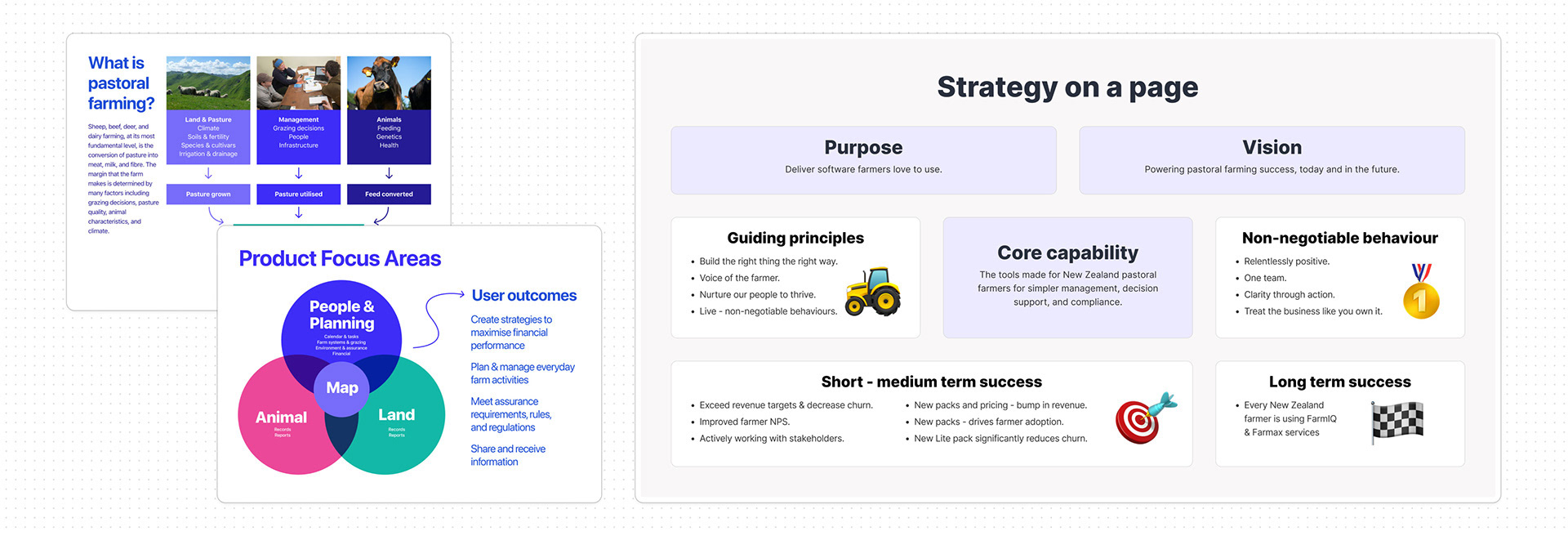
Reviewing FarmIQ's purpose and vision, which led us to create our Design Team's Mission.

Design Principles became our decision‑making shortcuts — helping the team design, review, and validate faster with shared clarity.
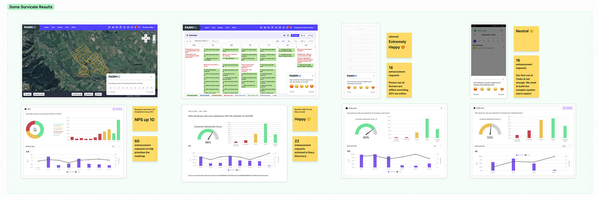
In-product feedback allowed us to reach workers and managers in context and enabled us to validate and iterate quickly.
Education moment: Our Design System & how to use it
What the Design Team needs from the rest of Product
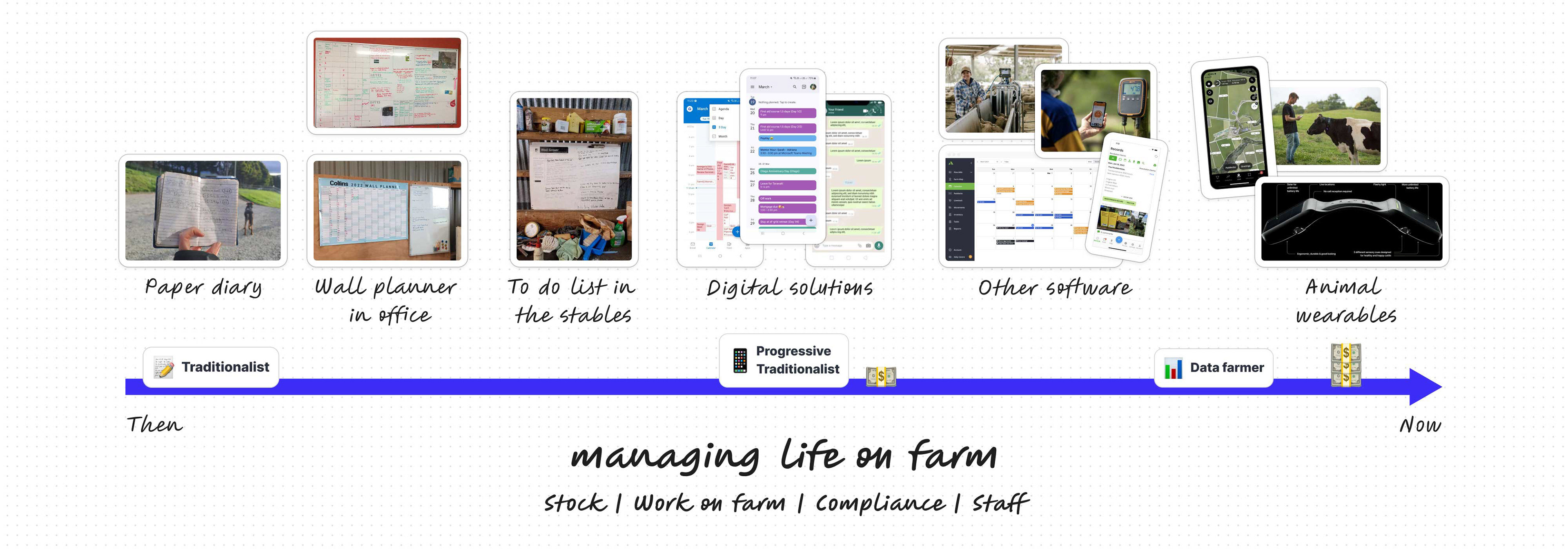
Modernising customer understanding to guide discovery and prioritisation, starting with our farmers' core job (JTBD), managing life on the farm .
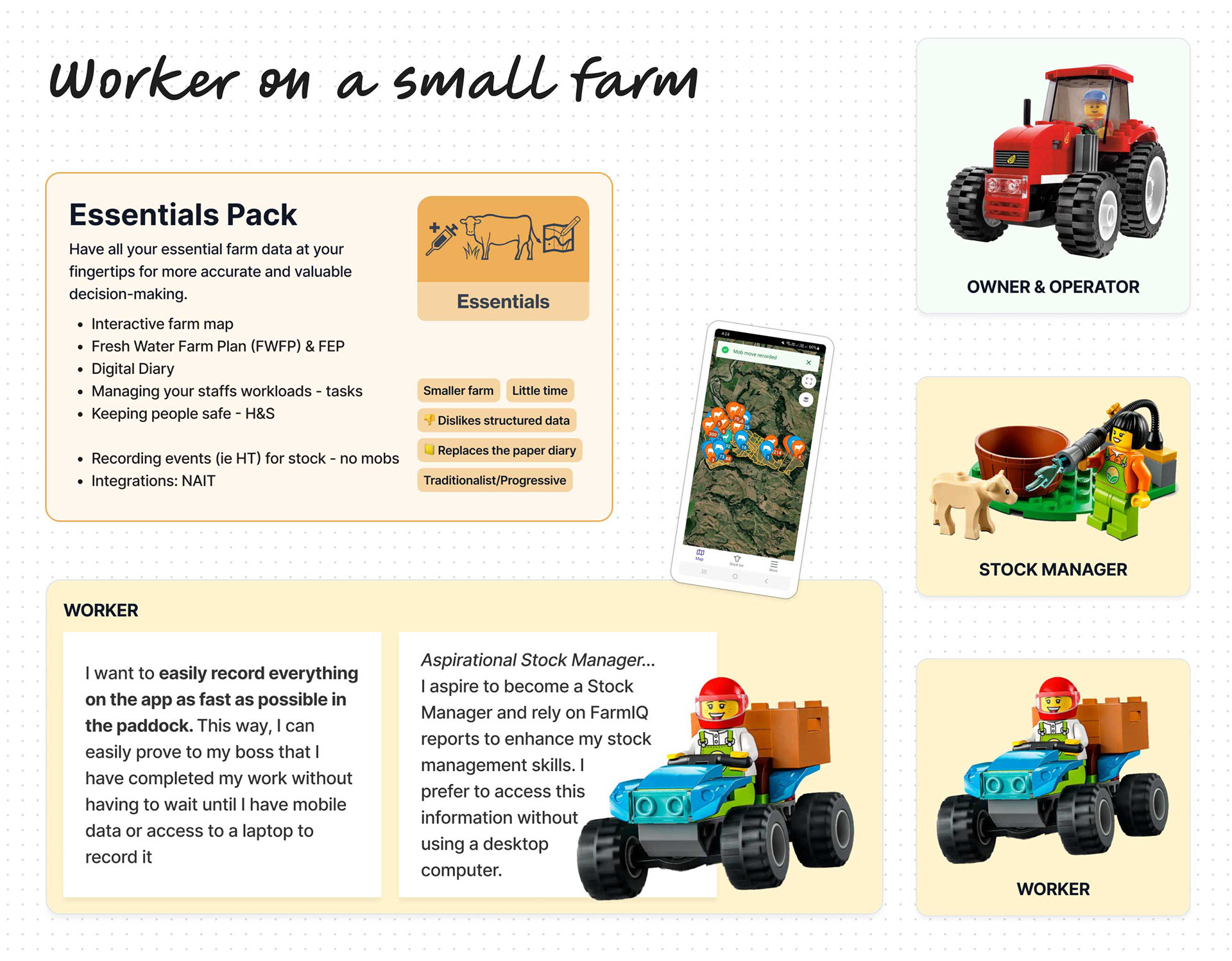
An example of our Worker on a small farm with a budget.
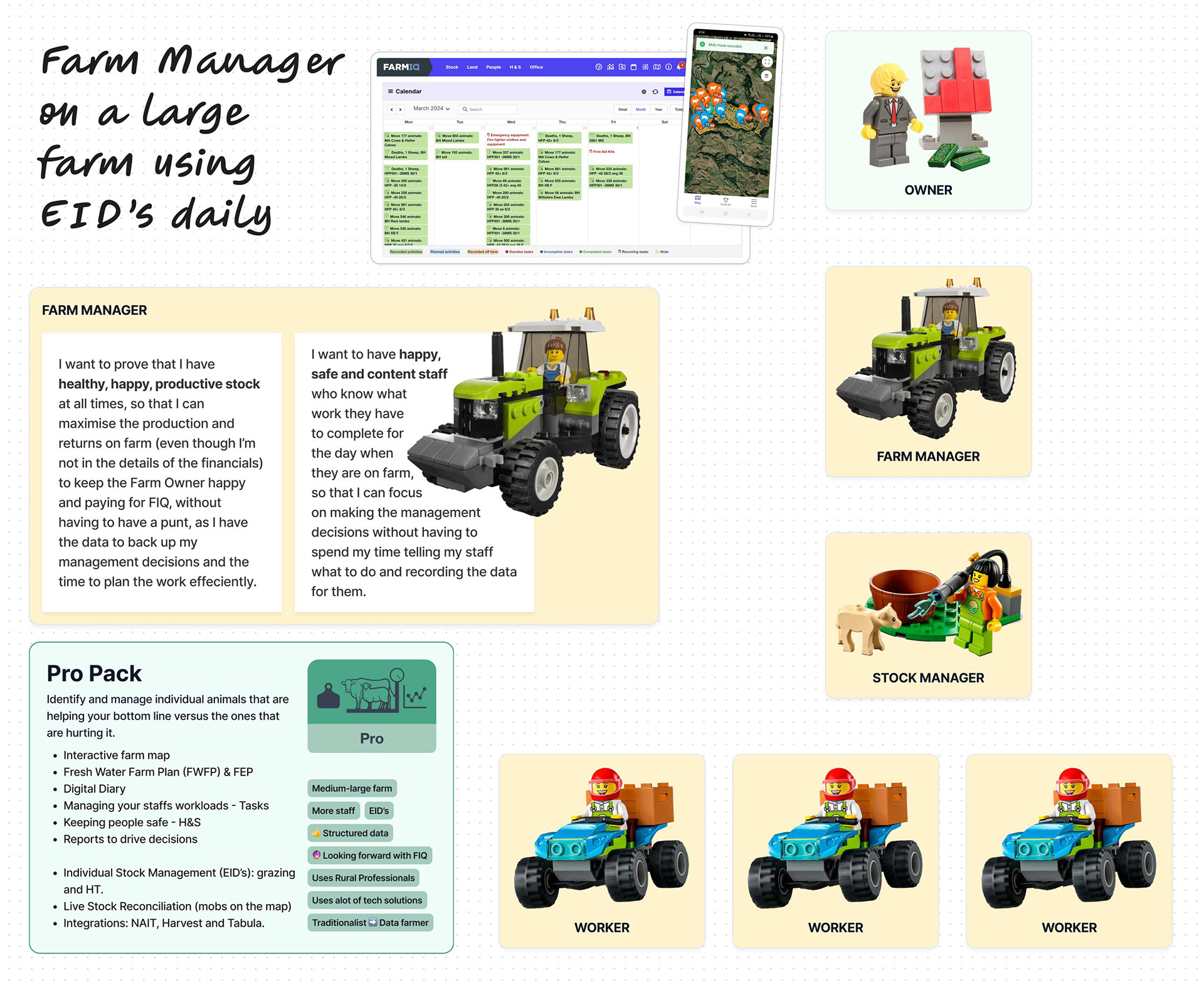
An example of our Farm Manager on a large farm with lots of staff.
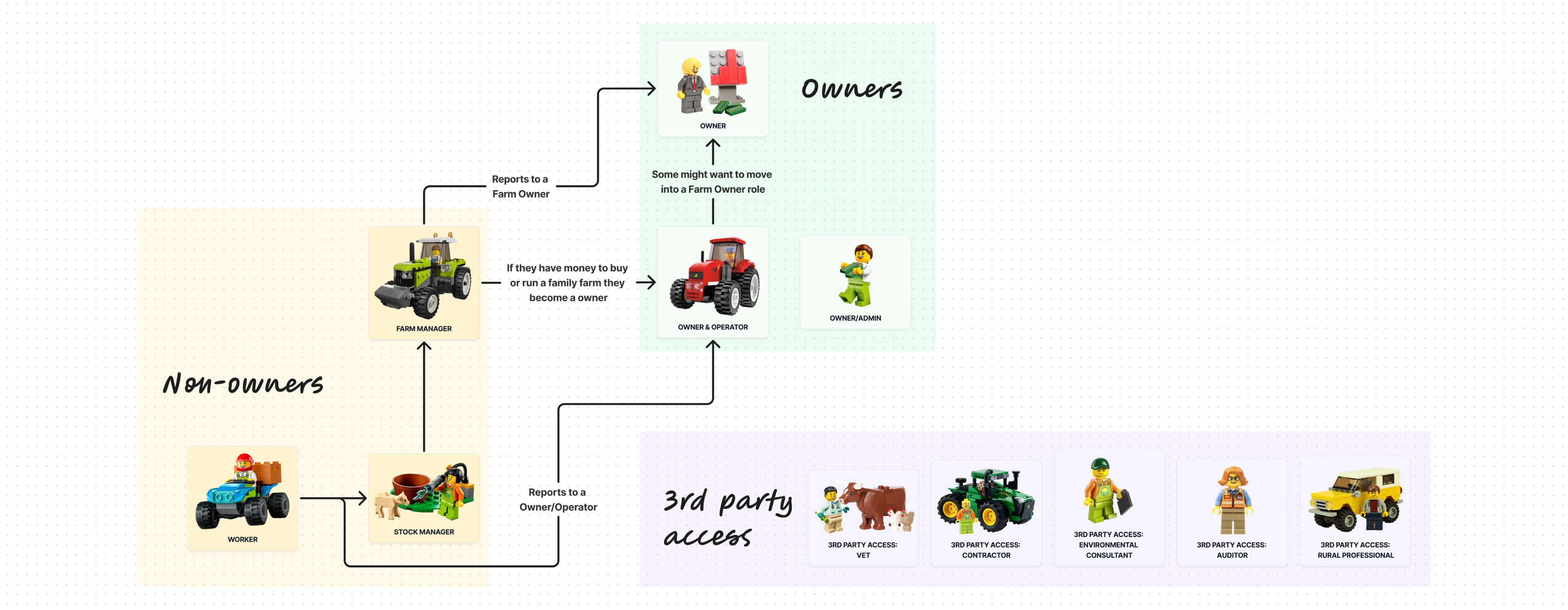
Role Relationships
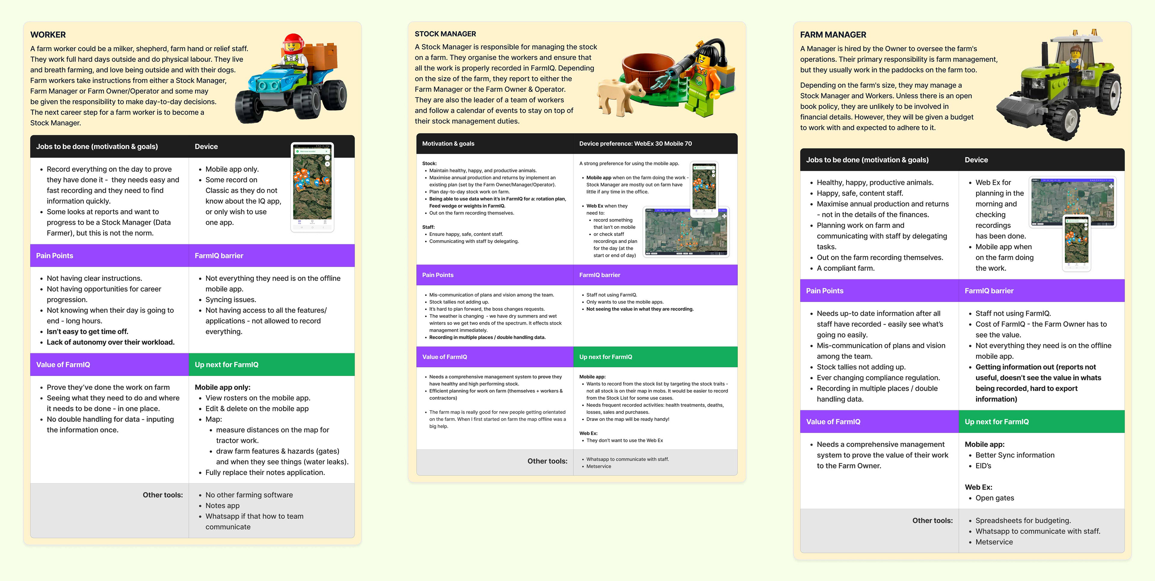
Example of our roles on a page
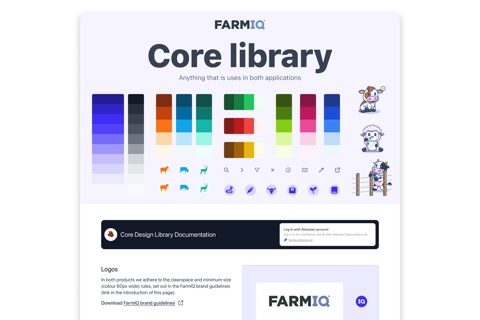
Our Core Library: foundations that standardise colour, iconography, and shared assets, creating the building blocks for a cohesive, scalable design system.
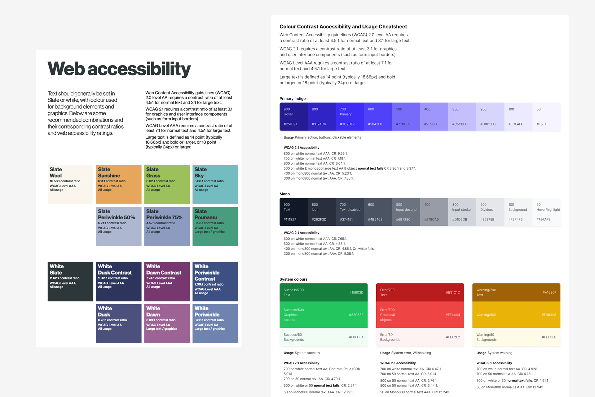
Accessibility‑driven colour tokens that standardise contrast, usage, and decision‑making across the product—lifting consistency and ensuring WCAG compliance at scale.
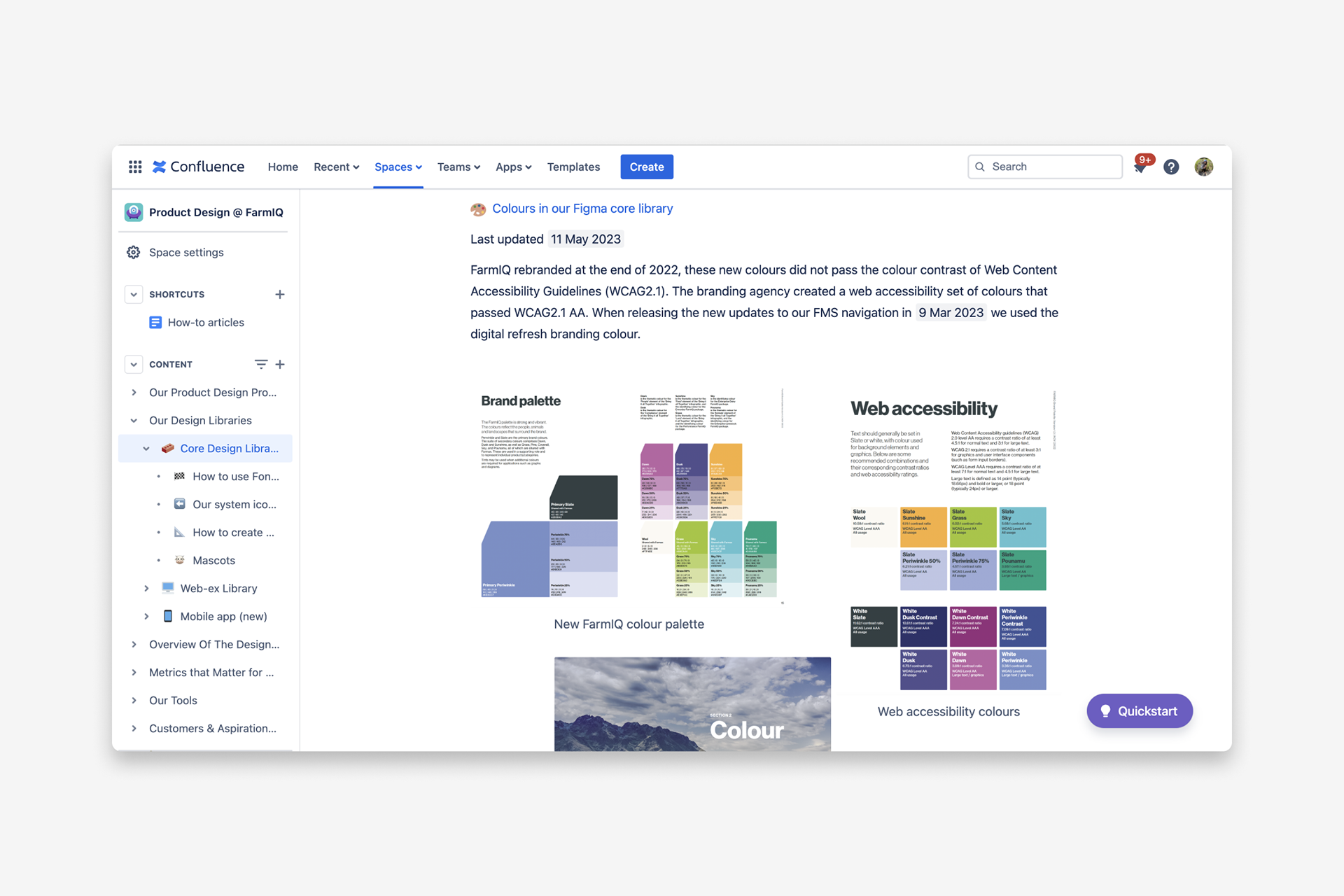
Core library documentation that unifies design, product, and marketing through shared standards and accessible foundations.
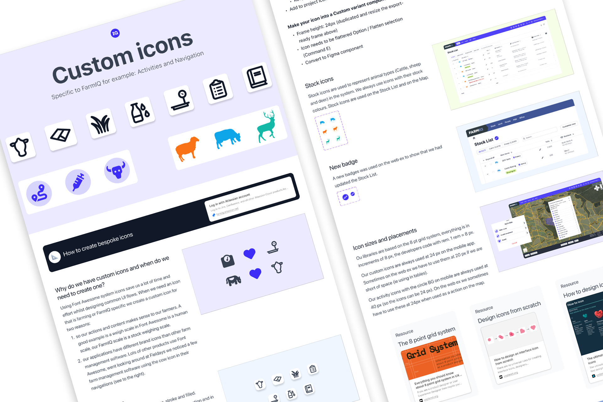
Iconography rules and guidance that help designers apply a cohesive, accessible, and scalable visual system.
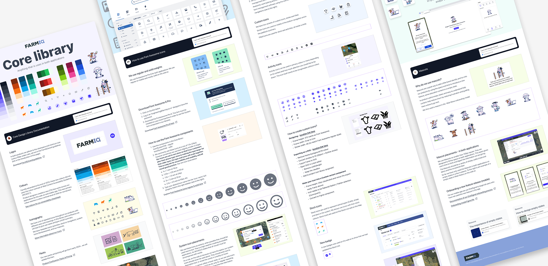
The full Core Library
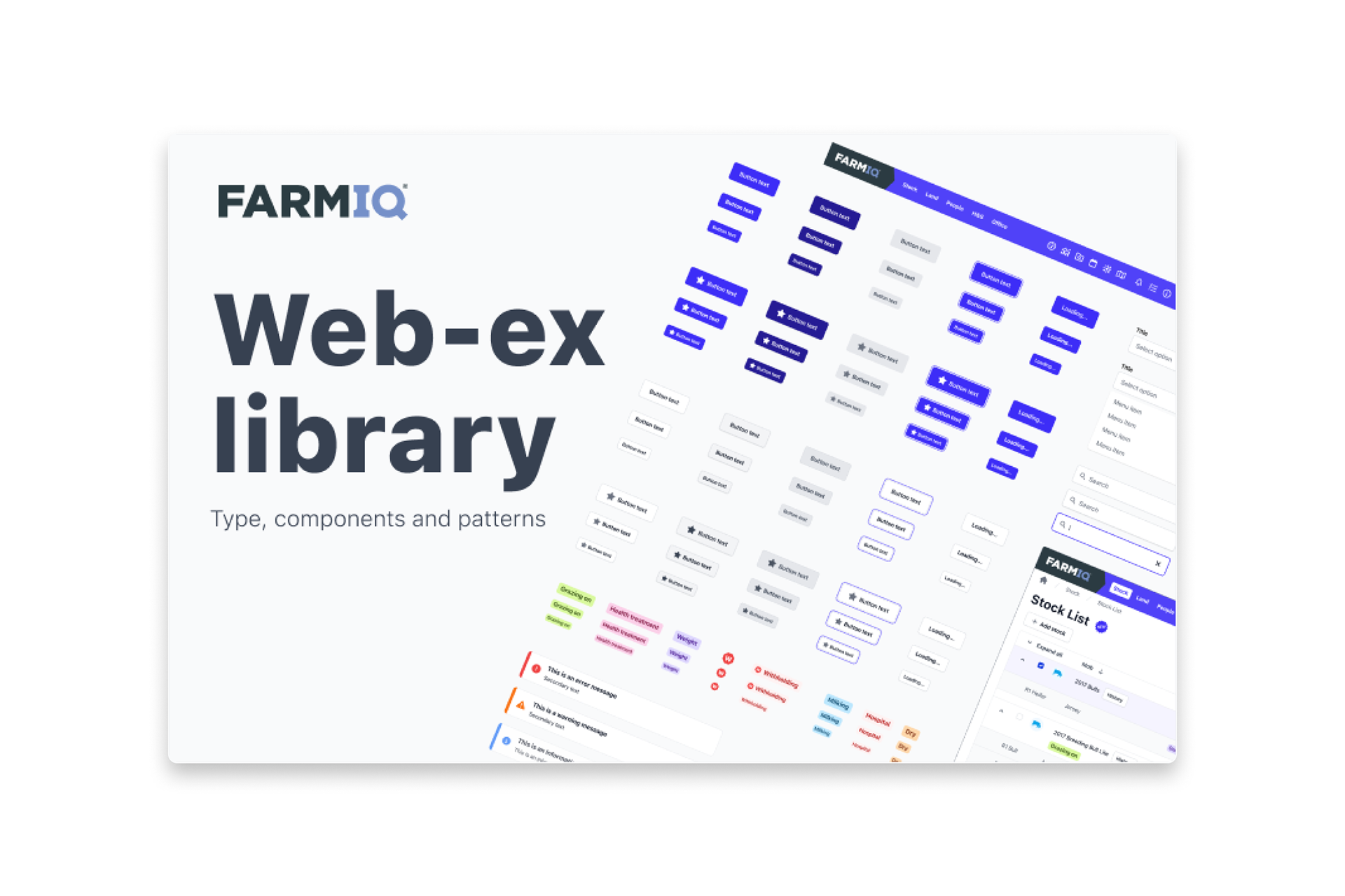
Our Web Experience library
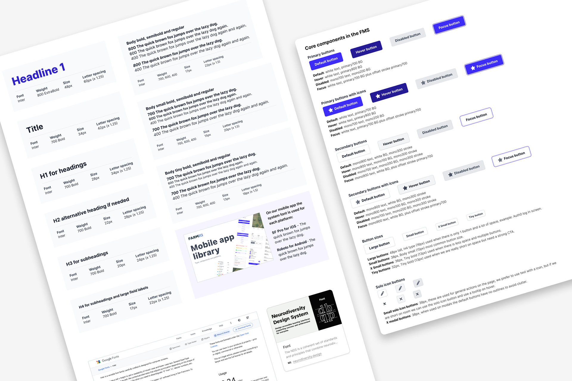
Web component set with states, variants, and usage guidance to reduce ambiguity and rework.
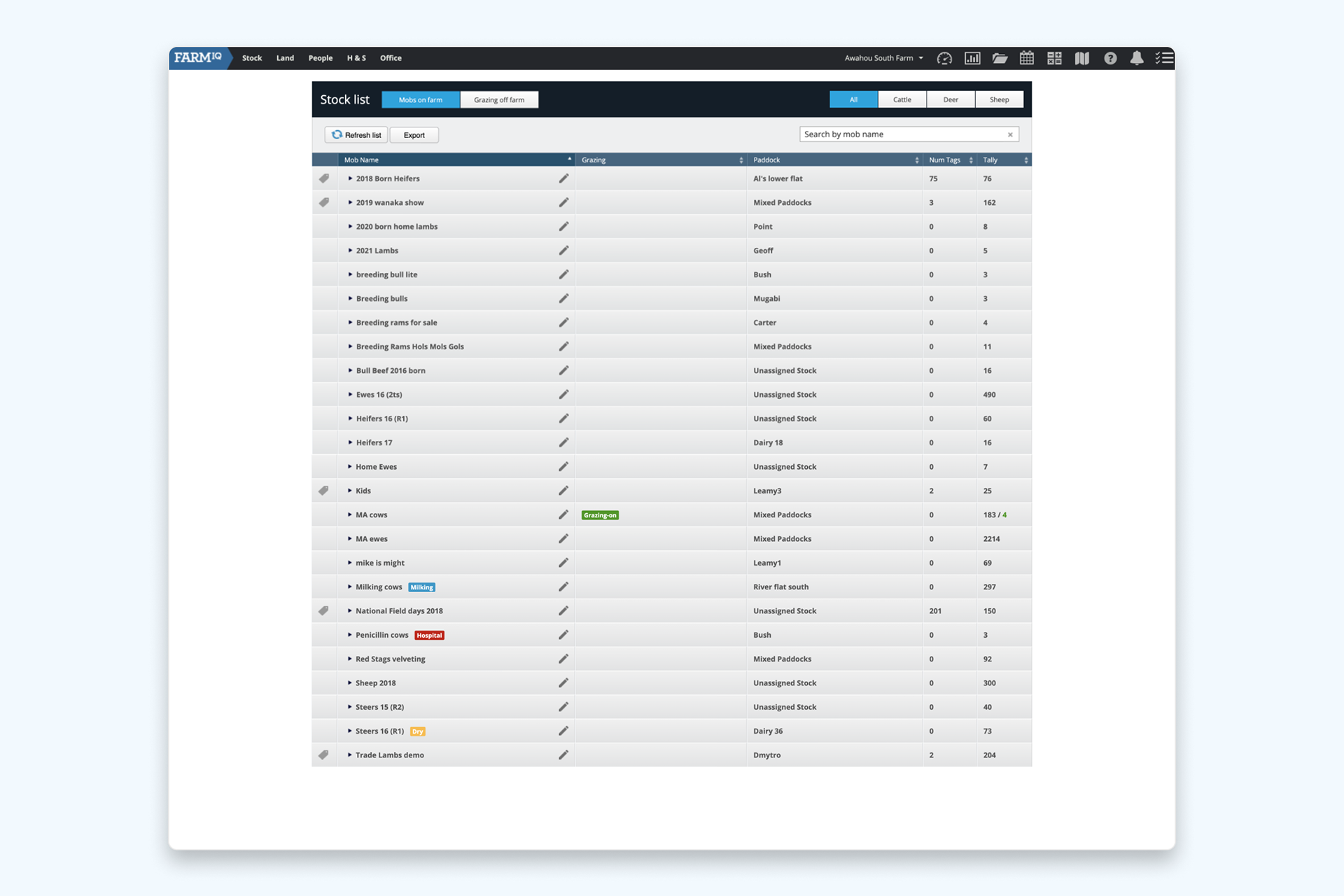
Web application before aligning with our updated brand
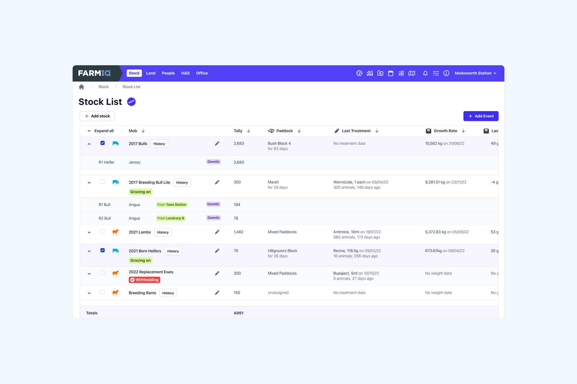
Web application after we have aligned with our updated FarmIQ & Farmax brand
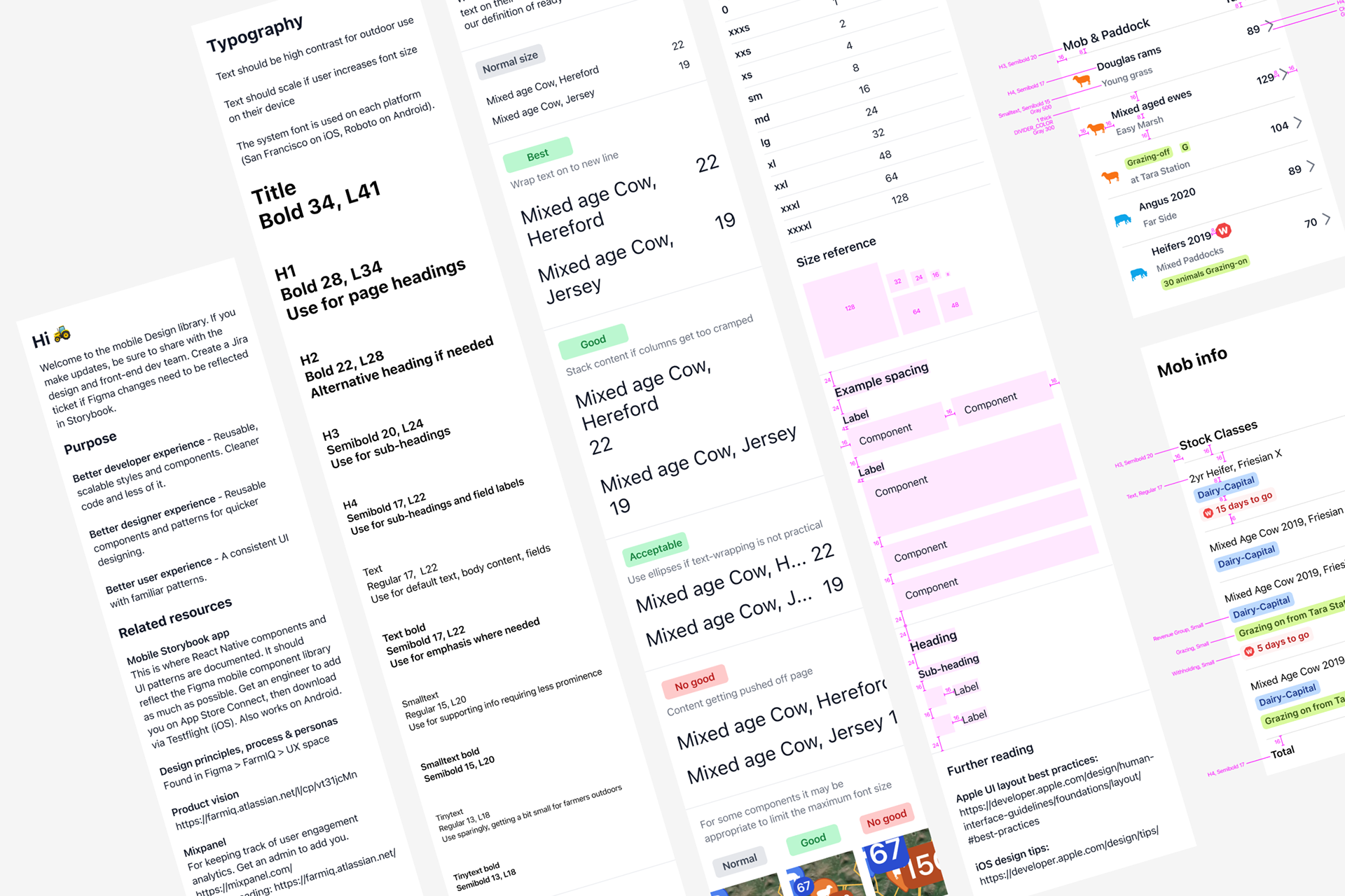
Detailed mobile typography and component specifications that standardise how designers apply hierarchy, spacing, and interaction patterns—improving consistency and reducing ambiguity across screens.
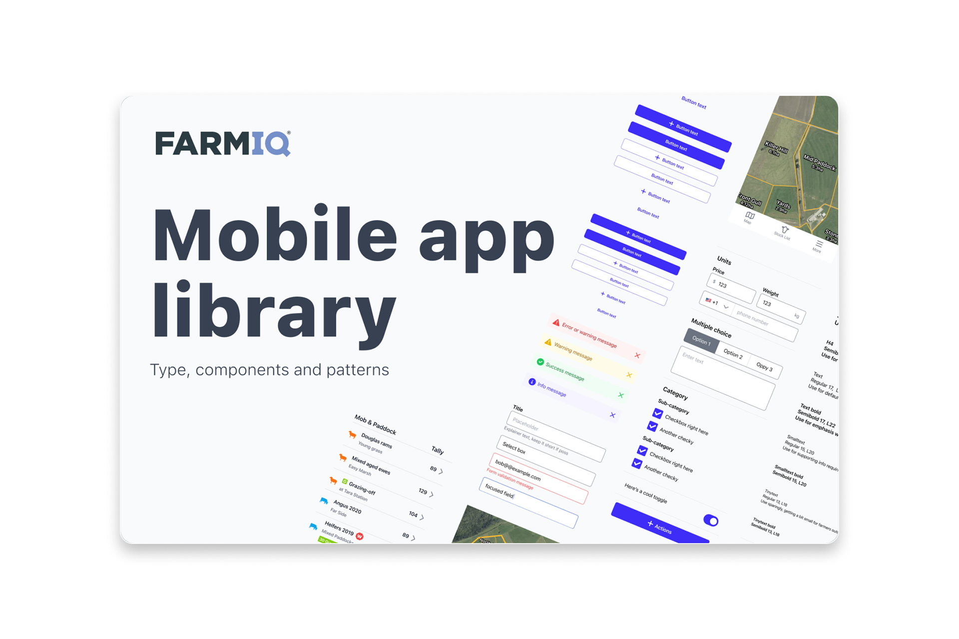
Our mobile app component library—platform‑ready patterns aligned to tokens, ensuring cohesive, scalable, and high‑quality mobile experiences across the FarmIQ product suite.